
Project Duration
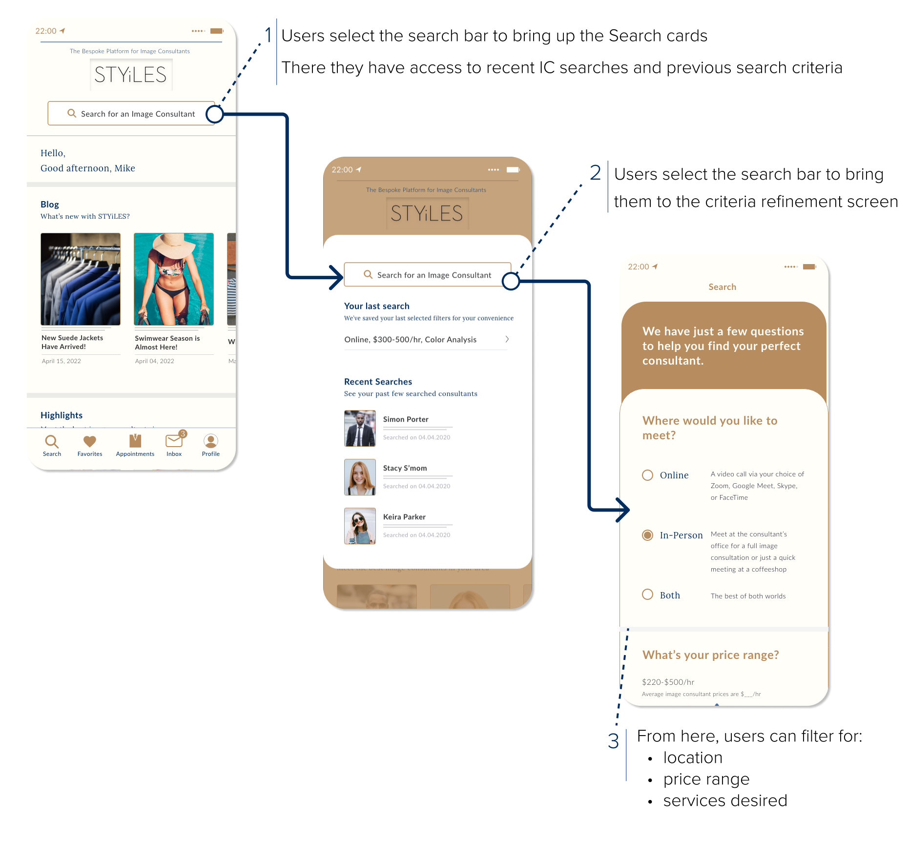
I worked with the team for three months on an internship contract. It was already in progress when I joined in, and it officially launched three months after I left, so the project most likely took about 7-8 months
Client
Style Konsult, a fashion company based out of New York and South Korea
Role
I was hired on as a UI/UX design intern to help create a light-mode redesign of an image consultation service app. While my role fell more into the UI side of things, I still made sure to implement UX principles into the designs to ensure user satisfaction
Team
Anusha Rao [UI/UX Designer, Lead], John-Vincent Dimailig [UI/UX Designer]
Contribution
Ideation, prototyping, UI design, UX design, interaction design
Tools
Adobe XD, Photoshop, Illustrator, Google Meet
So what is STYiLES?
STYiLES (pronounced as "styles") is an app made by Style Konsult, an image and fashion consultation agency tailored mainly towards men. The app is intended to be a “one-stop shop for image consultants, personal shoppers, and personal stylists.” It offers personalized styling, shopping, and consultation services.
There’s two sides to the app:
The image consultant side
• Manage their individual clients (and their measurements)
• Shop for them
• Manage their bookings
• Set their schedule/availability
• Message clients
The client side
• Help users search for image consultants and book sessions
• Manage their appointments
• Message image consultants
• Read blog posts
Disclaimer: Multiple Tasks, Multiple Goals
Our team was given multiple tasks, most of which were unrelated, but overall built towards completing the design of the app.
This case study will jump between some of the projects assigned to us.
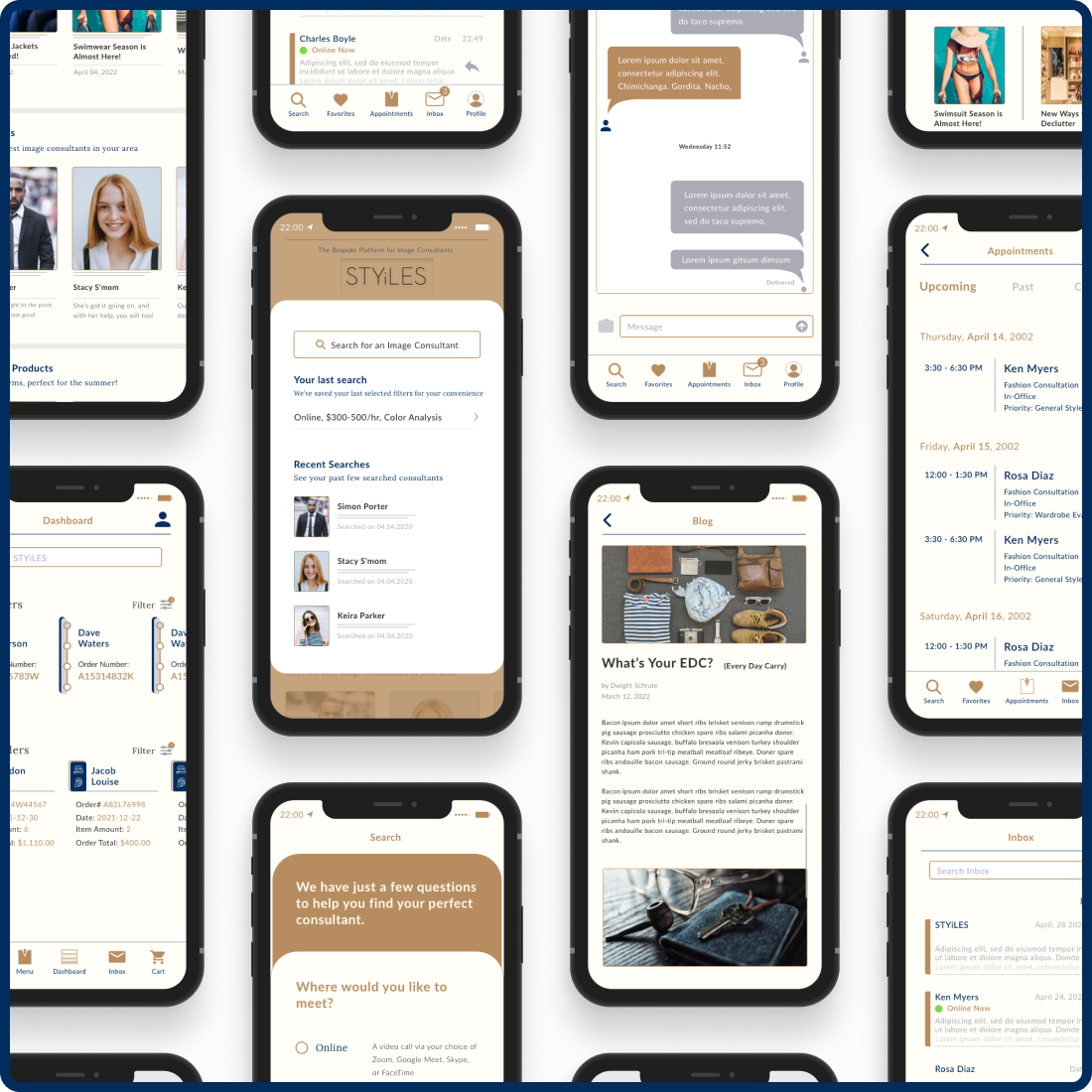
Project 1: Too Hard to Read
Problem:
Reports state that users were finding the dark color scheme of the app too hard to read.
Our team wanted to revise the appearance of the app into a lighter tone to solve that issue.
Pain Points:
• Users had trouble reading the text on the various screens
• App lacked many expected features
• Many pages were incomplete and missing information
• Entire experience is not engaging and lacks professional polish
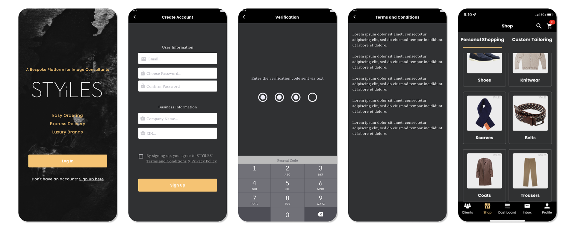
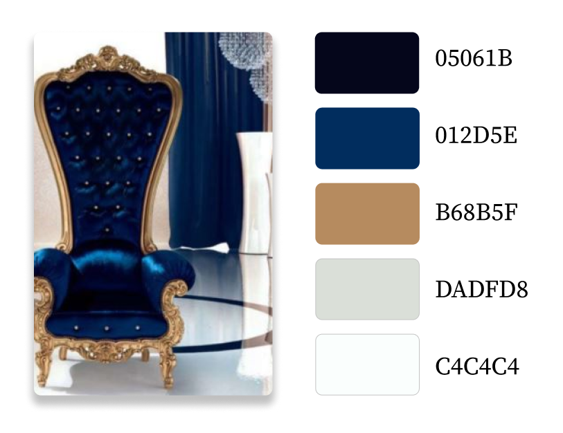
Updated Color Palette
The CEO of the company sent us a request to update the app's color scheme. This picture was their inspiration and the colors showed a sense of elegance, class, and poise; all elements the team wanted STYiLES to exude.
Iterations
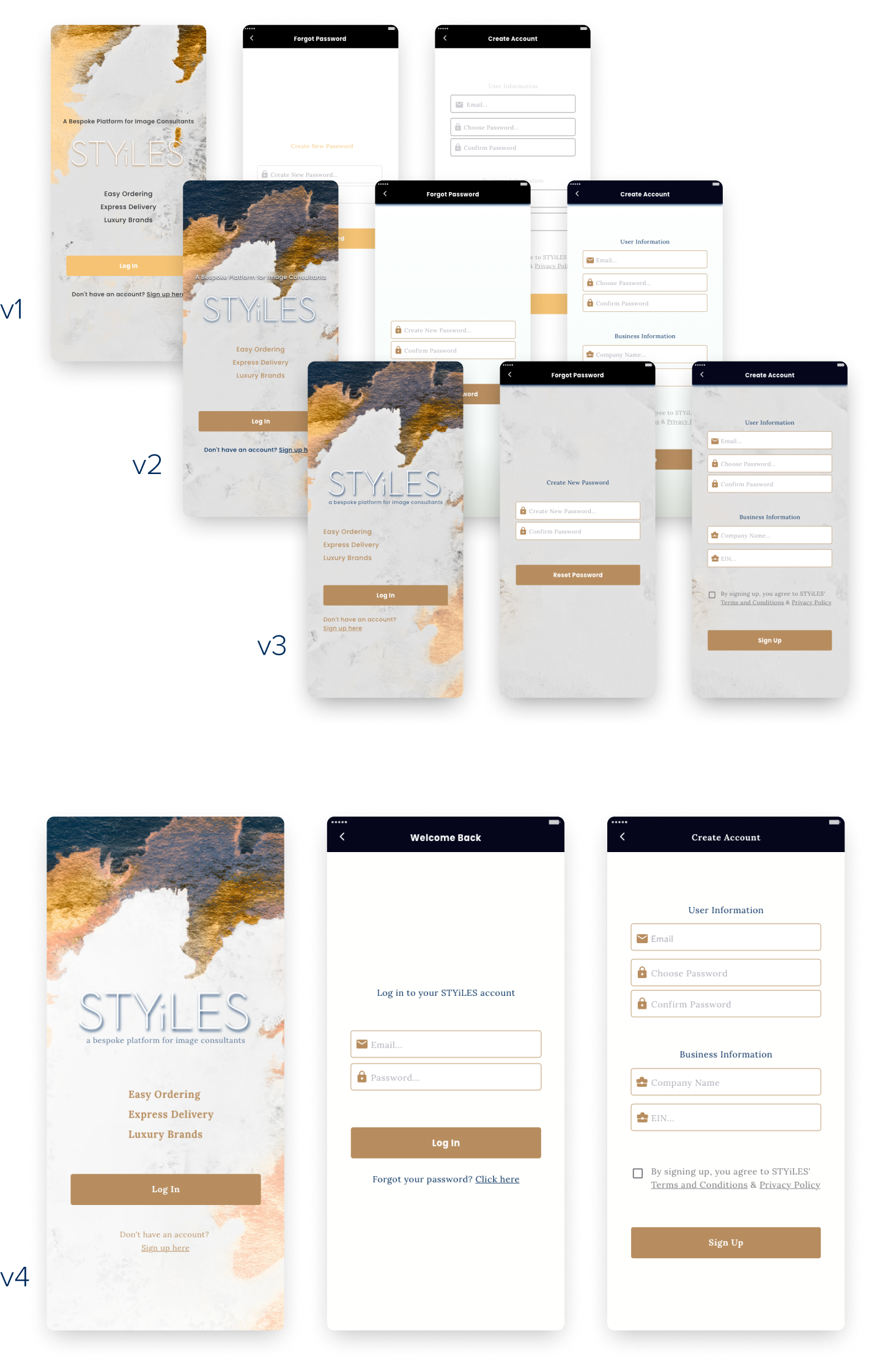
Notable Changes:
• Text is more easily readable
• Background of onboarding pages have better cohesion with splash page
Project 2: Shop Icon Creation
Problem:
Current shop icon does not mesh well with company's theme
I started by sketching some ideas incorporating the shopping aspect with the industry of the company.
My intention was to combine a suit with a shopping bag, hence the handle, but I got a couple unexpected reactions...
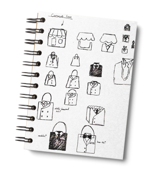
“Is that a purse?”
“I see a purse”
Admittedly, after they pointed that out I did see where they were coming from.
I tried a couple different variations with disconnected handles, and different widths, but it just brought on new unexpected reactions.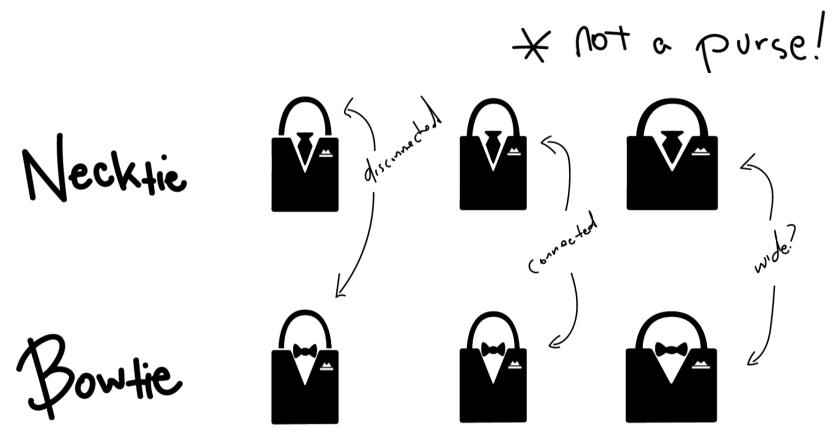
“Now it looks like a padlock”
😐😐😑😑
Okay, what if I just take off the handle and just turn it into a simple suit icon?
And I'll remove the pocket square to help simplify it since it's going to be a small icon anyway.
Also, seems like the bowtie wasn't as preferred so I just narrowed it down to the necktie.
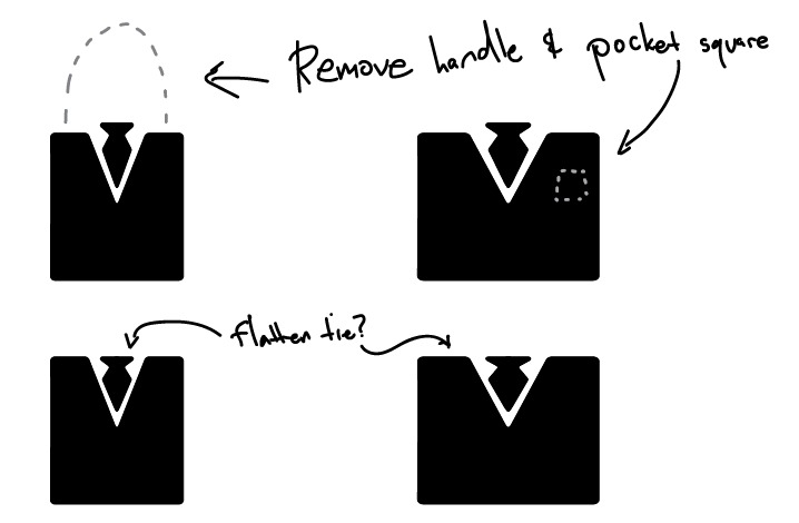
"I like it, but not the fatter one"
Fine with me. That works. The non-flattened tie version was also chosen instead.
Let's make it gold to match the color scheme and move forward.

Project 3: Dashboard Revamp
Problem:
Current dashboard lacking features.
Now that the shop icon was done, I started work on redesigning the dashboard screen to make it more engaging.
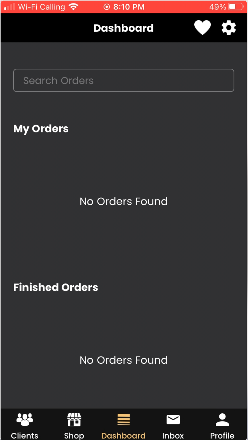
As you can see, I didn't have much to work with.
The dashboard was pretty barebones in the previous app. I'm sure once orders started populating the empty areas, it would look more lively, but this was a barren desert at this point.
Keeping with the general layout, I updated the color scheme and added icons given to me by our team for the Orders section.
Also added after some feedback from the CEO was an easy way to see the messages between clients and image consultants.
Goal:
Implement sections to provide at-a-glance information quickly as an overview
Notable Changes:
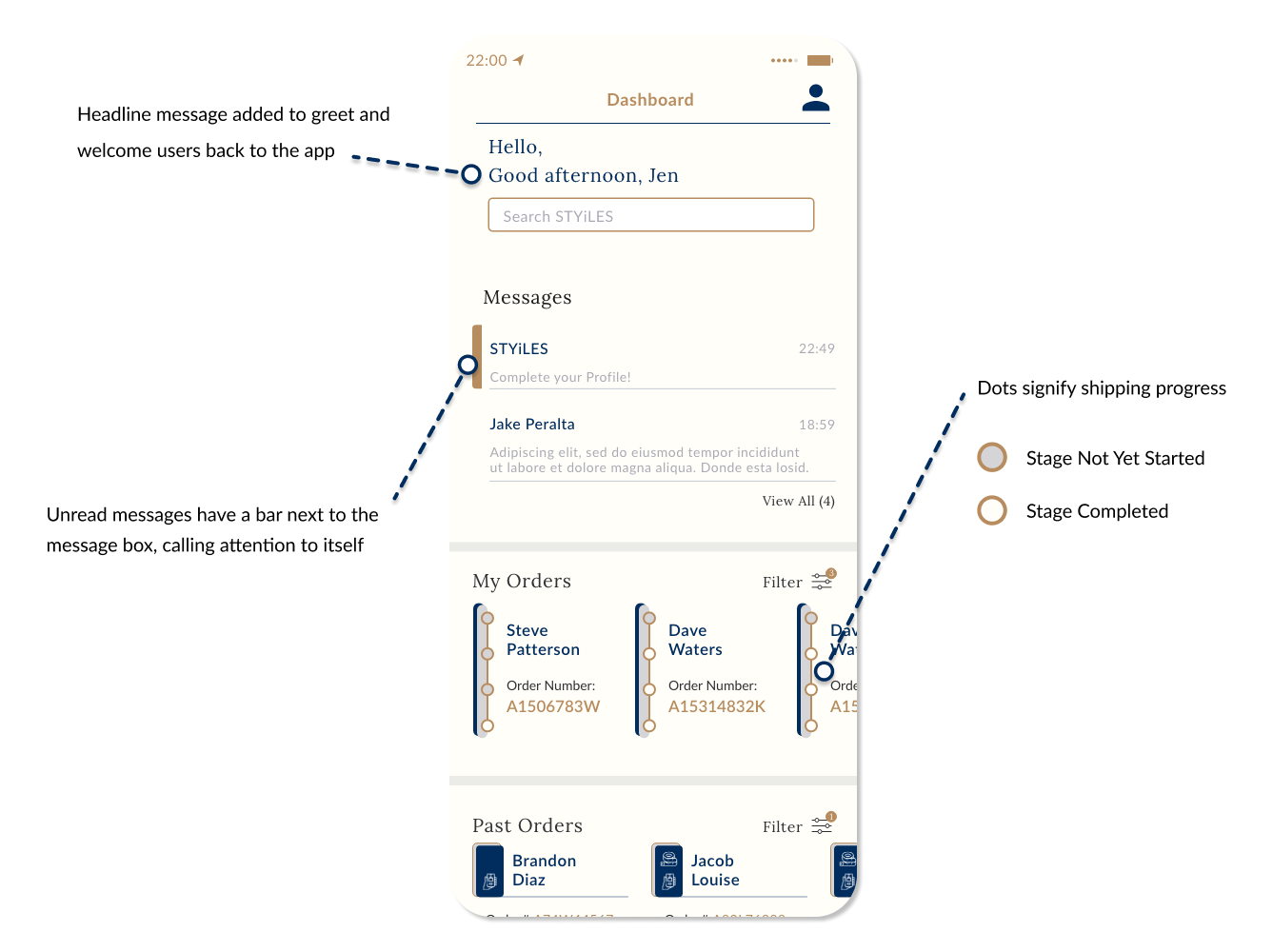
• A dynamic welcome message was added above the search bar that changes on time of day
• A section for viewing messages was added w/ brief preview of message
• A way to quickly view past orders
• A way to quickly track status of current orders in stages
4 Stages. The higher up the dots, the further along the shipping process.
Shipping dots are expanded with more detail in Orders page, this time horizontally with arrows

Featured in a section further down
The CEO kept having new ideas each week and we had to constantly evolve the design iterations and work them in a cohesive way.
The app went from a men's fashion consultation company to now include clothing options for women as well.
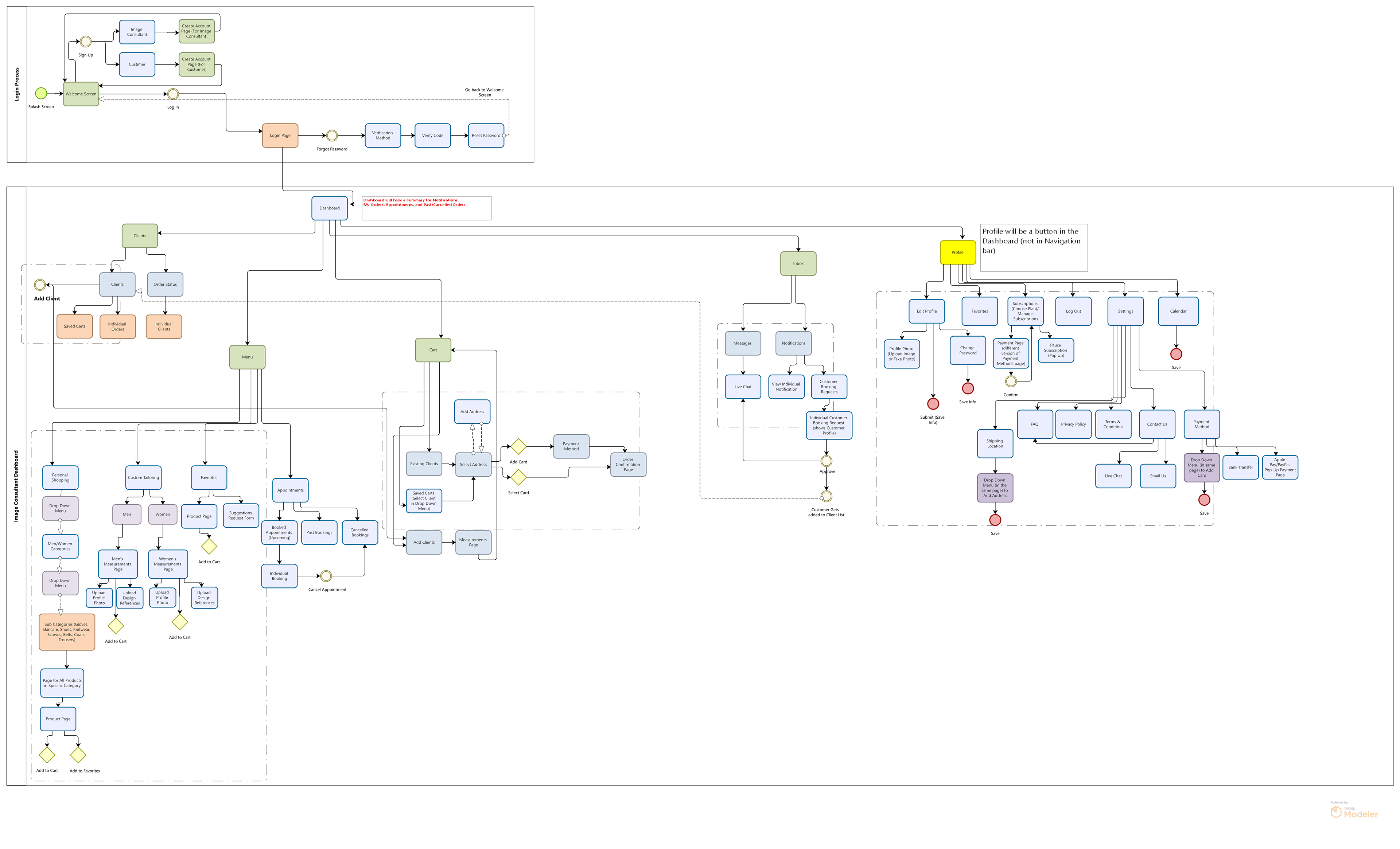
Flowchart Secured
Eventually, we received the intended final flowchart for the image consultant side of the app, with some added new sections. At least now our team knew what pages needed to be made and how the intended flow would work.
Project 4a: Wrapping Up the IC Side
Goal:
Implement updates to remaining pages of the Image Consultant (IC) side and move on to Client side
From here, much of the process was a lot of jumping around.
Making a tweak to a component of a certain page meant having to match that style on a different page where the component had a different form. There wasn't a very strict structure on which screen to work on, so all were essentially being designed and iterated at the same time.
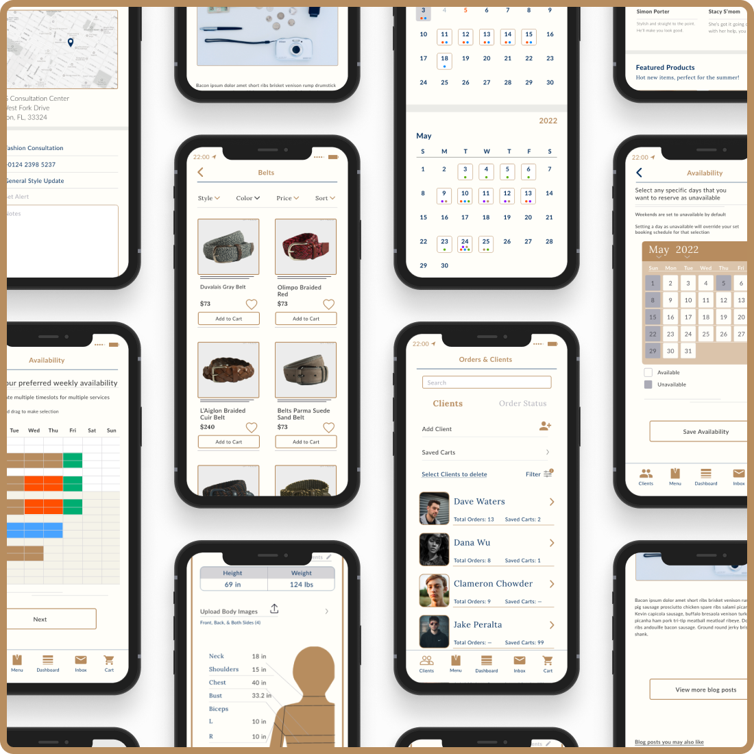
A quick fly-by of a sample of the finalized features and pages for the Image Consultant side:
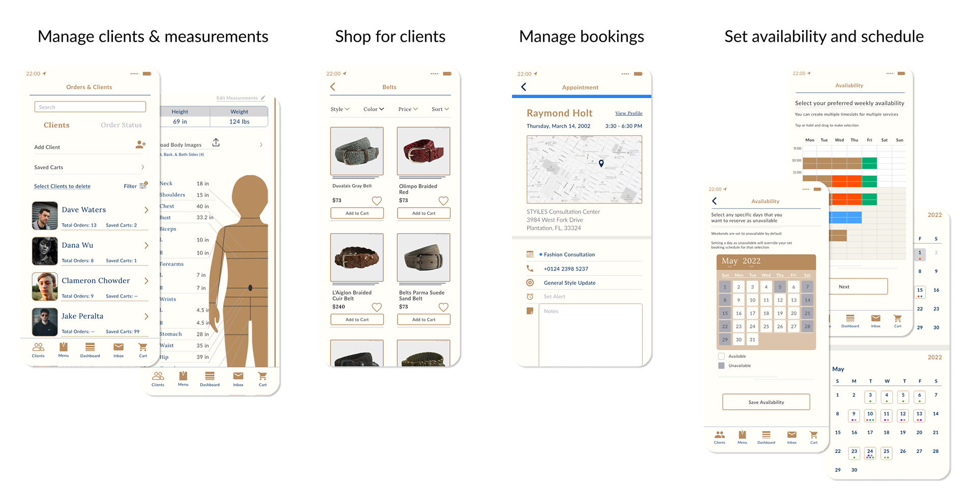
Orders & Clients
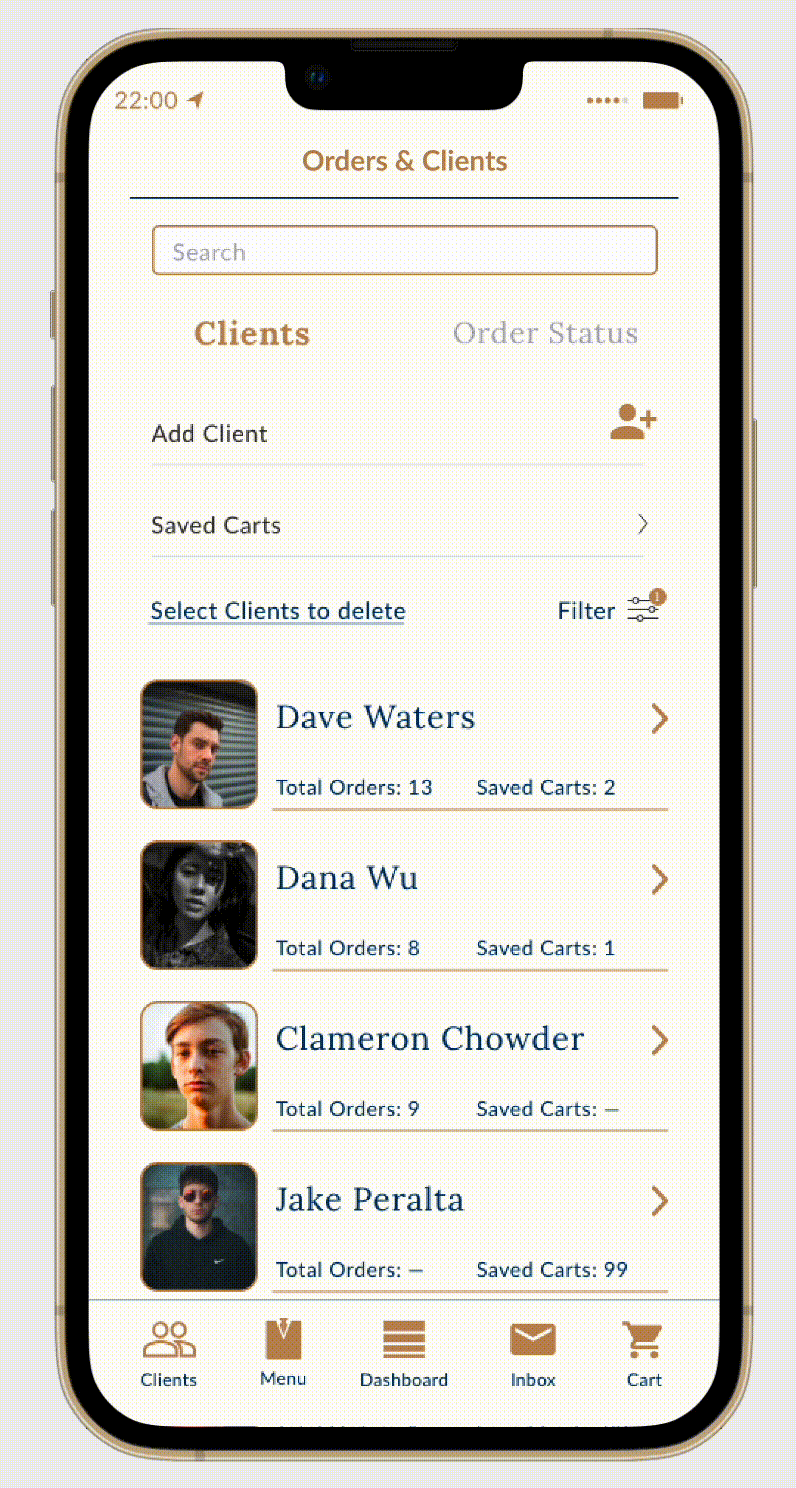
• Add/Edit existing clients
• View the saved carts of clients
• See at a quick glance, the total order number and saved cart number of each client
• One quick swipe takes you to the Order Status screen
• Easy access to search bar functionality
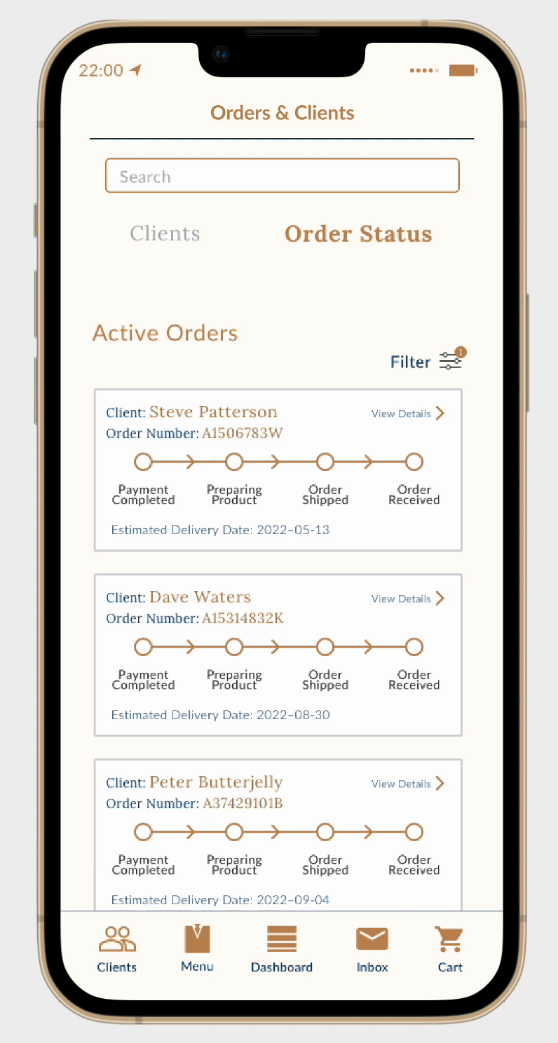
• Able to see all active orders from clients at-a-glance and what the order status' are visualized by the dots on a linear timeline
• View past completed and cancelled
• View detailed information regarding an order including:
- Order number
- Shipping info
- Items ordered
- Payment info
- Billing/shipping address
- Order summary with total
Client details & measurements
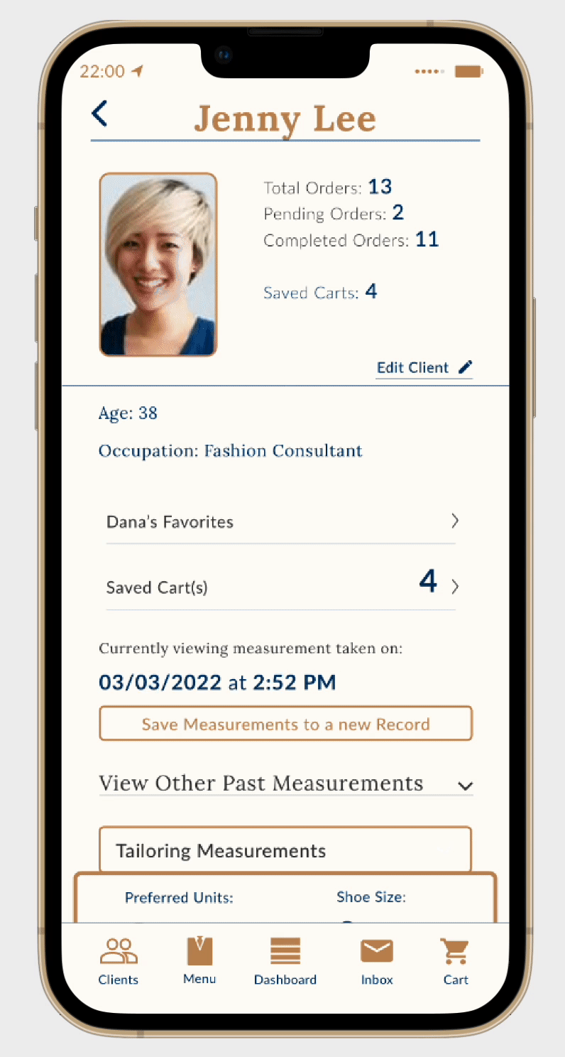
• Easy to see data of the client including order information, saved carts, and favorites
• Edit client details including age, occupation, and skin tone
• View all the tailoring measurements of the selected client
• View past saved measurements
• Upload design references for client tastes
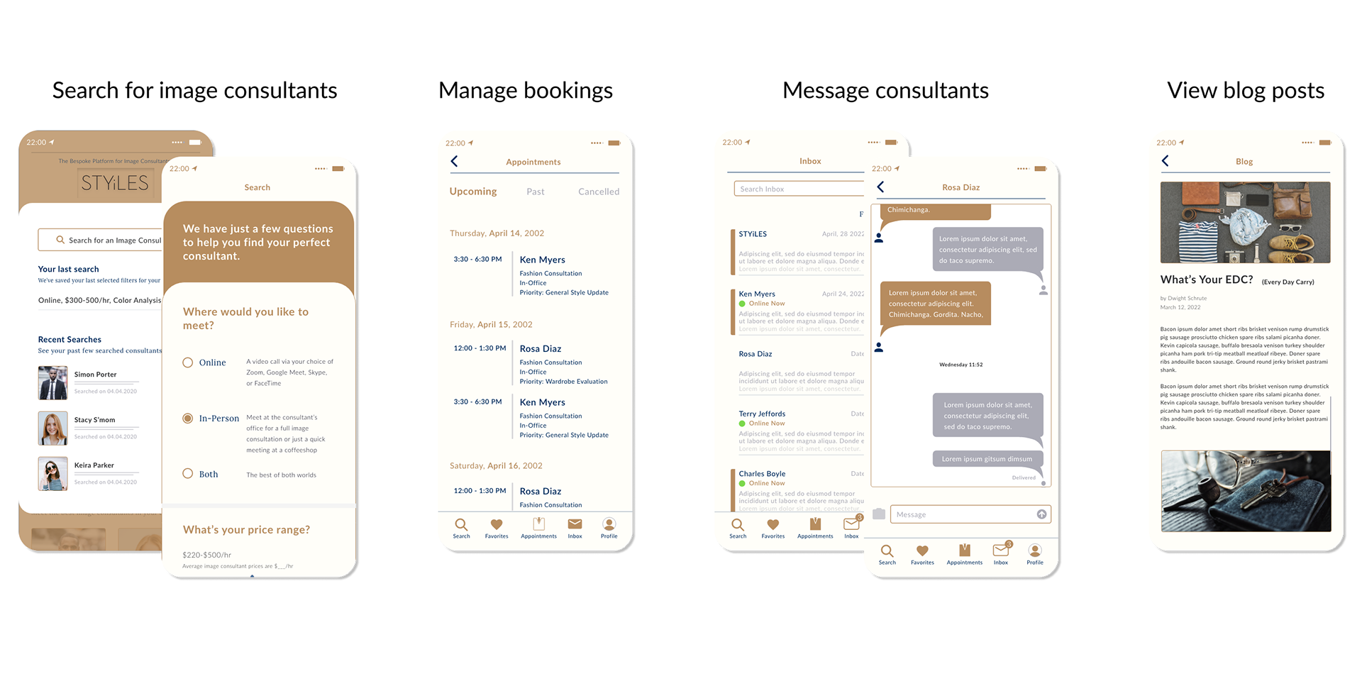
Project 4b: The Client Side
With the Image Consultant side done, a lot of the design elements were already in place when designing the Client side. Just a few tweaks here and there were needed. Many features were basically similar if not the same. Both sides retain the ability to manage bookings and client-to-IC messaging.
Unique to the Client side was the ability to view blog posts and view more in-depth searches of image consultants.
Bonus Task: Surprise Merger
Partway through designing the customer side, we received an update to the general layout and to just merge the dashboard and search page into one, so the main home page was just labeled as "Search"
The "Search" page wasn't solely dedicated to searching since other things were shown such as blog posts, highlighted image consultants, and featured products.
Personally, I feel sticking with "Dashboard" or even simply just "Home" would have been a better fit. I questioned this design decision since it didn’t save any time for the users and ultimately might just confuse them.
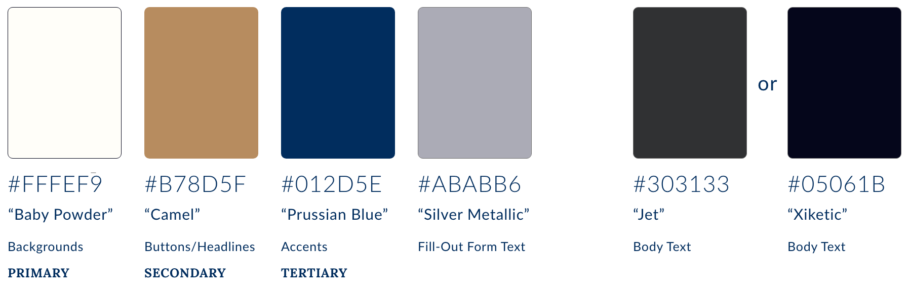
Style guide
Color Palette
We kept the general palette from the example image that was provided. The light white/beige “baby powder” became our primary color for backgrounds while the gold and blue primarily became the accent colors
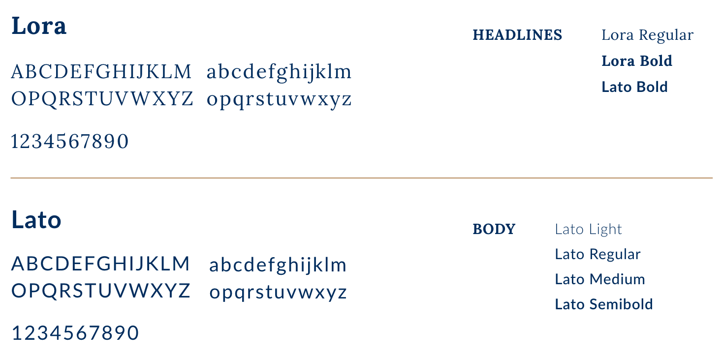
Typography
We decided to focus on only two fonts throughout the app to keep a clean, minimal look. One being serif, and the other sans-serif.
Final thoughts & takeaways
The spelling
A question that keeps popping up from not only me, but everyone I've shown the app to, was why the 'i' in STYiLES? I don't know, and I don't think I ever will. Most likely, it's just a stylistic decision from the CEO
⭐️⭐️⭐️⭐️⭐️
As an intern for Style Konsult I was surprised to see they went ahead with many of my design choices. It’s not exactly easy to measure the success of the results but as of the writing of this case study, the app has a 5-star review on the App Store so, along with positive feedback from the design team before we parted ways, I believe the results have been pretty good. Although it seems that not many users have used the app due to a lack of reviews and ratings. There were only 3 ratings as of 12.07.22
An option for dark mode
Even though the main focus of the project was to design a light theme, I know many users (me included), much prefer to use their devices in dark mode. In the future, I hope an option to view the app in dark mode will be included.
It's not just for personal preferences either, since from an accessibility standpoint, dark mode usually offers higher contrasting color values, which are easier to read. The previous design of the dark mode wasn't the most optimally designed for accessibility.