The Problem
When users reserve seats for a movie, some find the process to be too long or too complicated.
The Goal
Provide an easy to use, streamlined user flow for users trying to reserve movie theater seats.
Role
UX Designer, UX Researcher
Tools
Adobe XD
A primary user group identified through research were users already familiar with the process of reserving seats when buying tickets. They like to watch movies regularly and are general fans of movies in general.
A secondary group identified were users who don’t go to the movies as much, and as such, aren’t as used to the reserving process.
PAIN POINTS
CAST
IDEATION AND LOGO CREATION
DIGITAL WIREFRAMES
It was my intention to have the key information readily available within one or two clicks of each other.
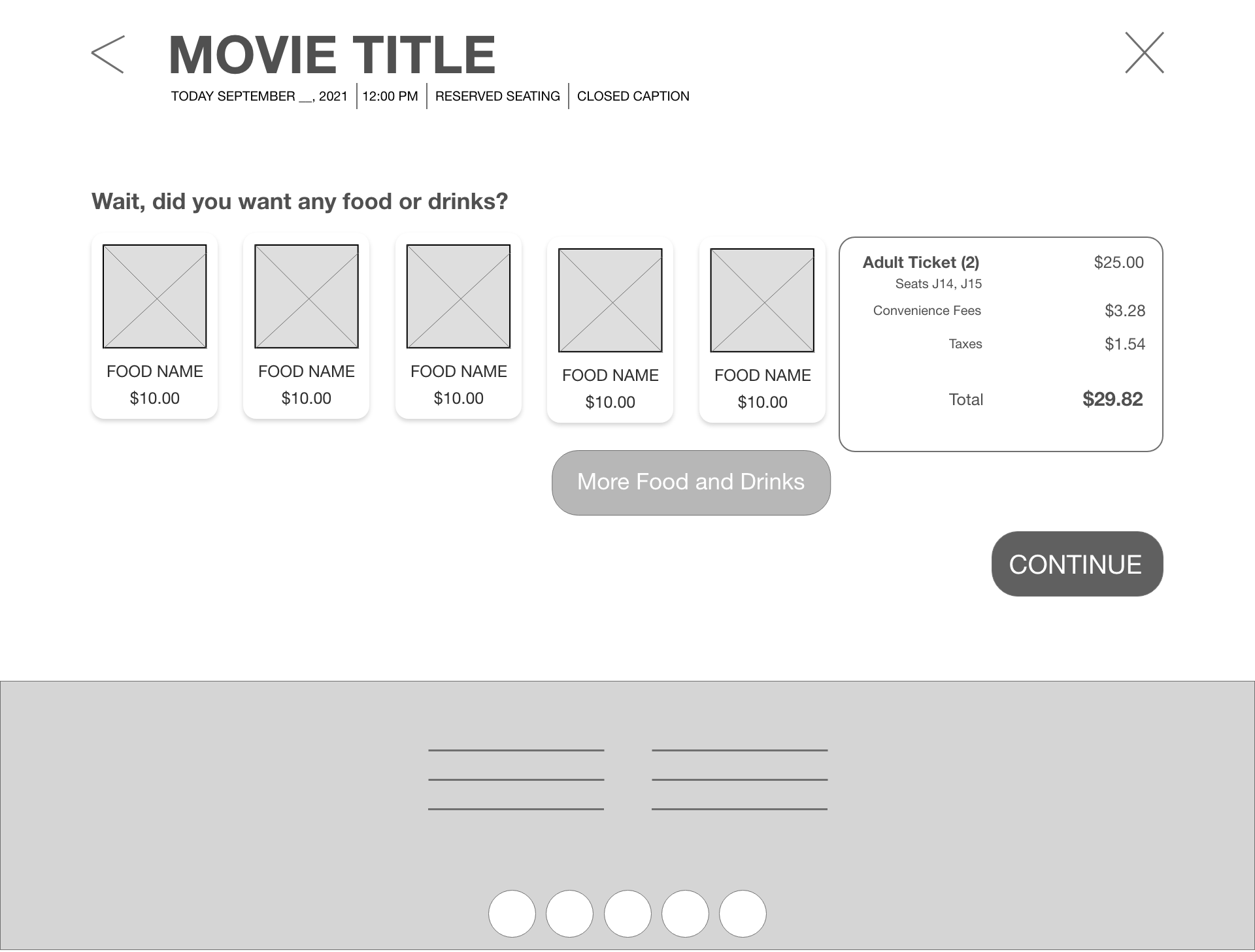
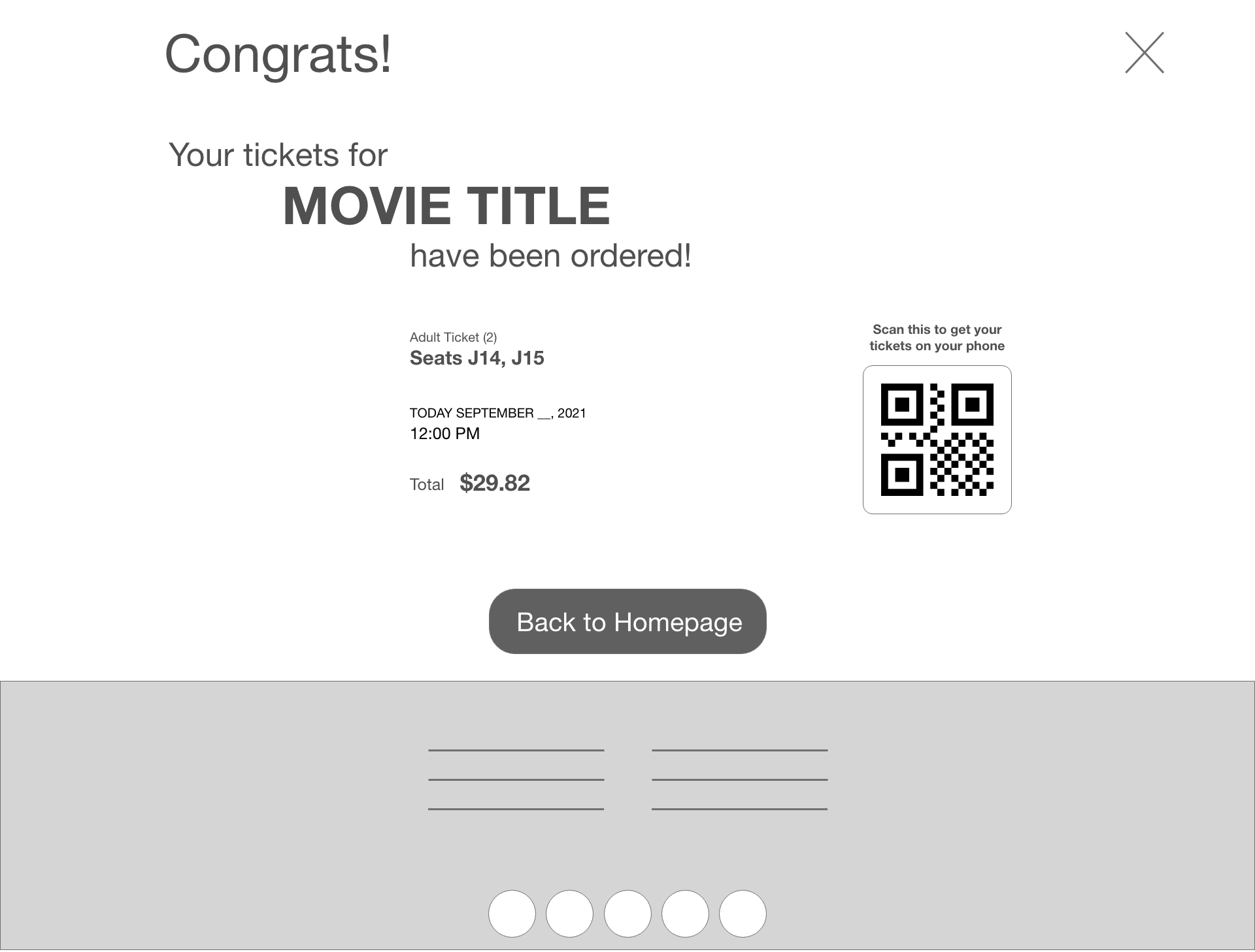
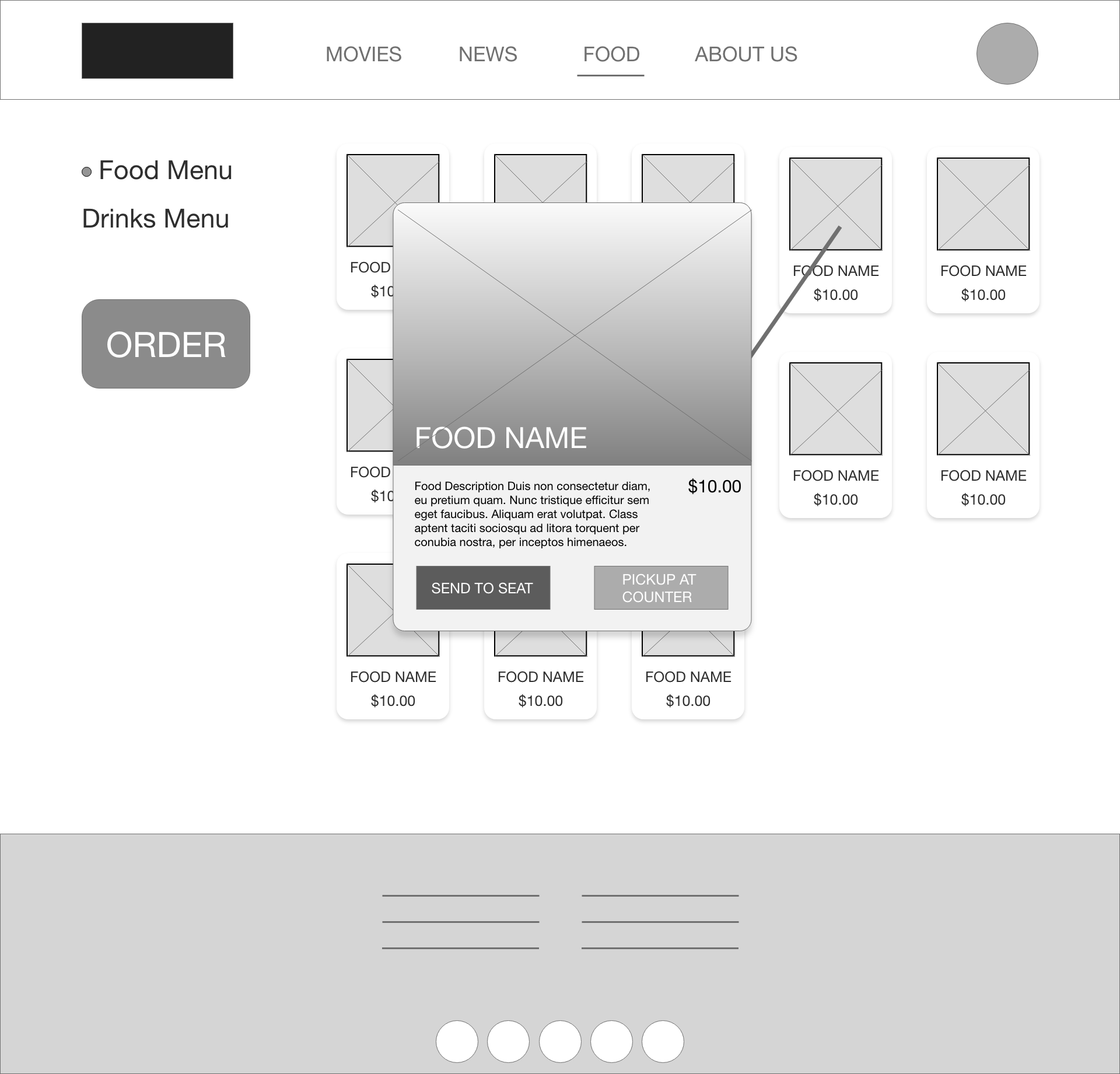
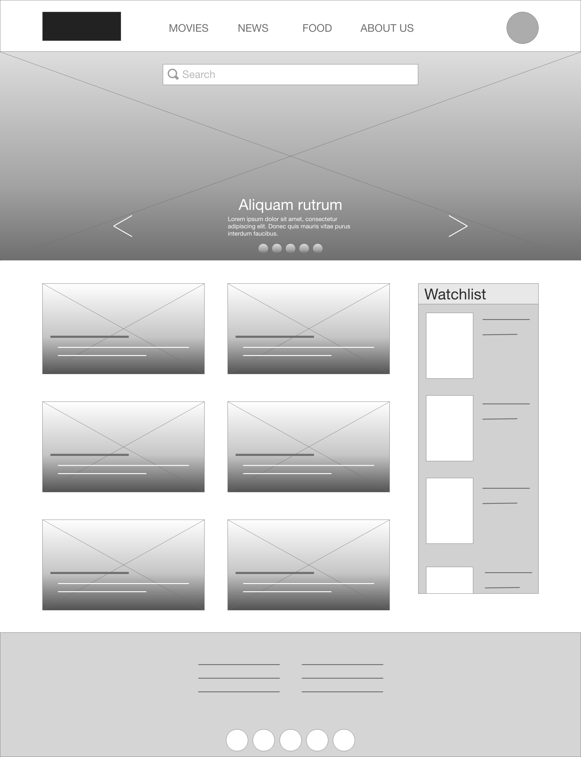
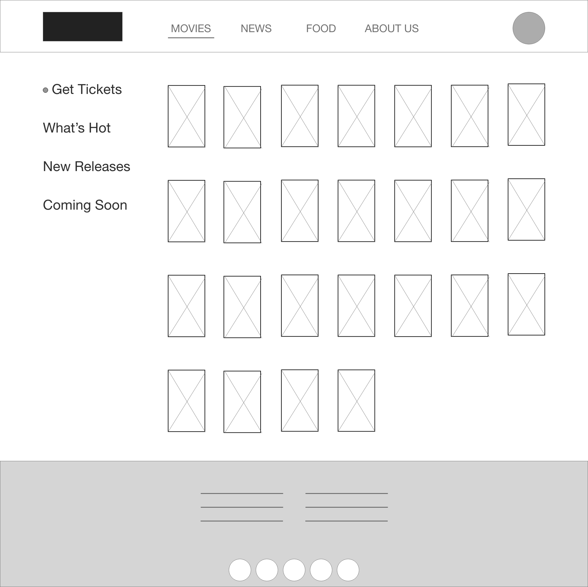

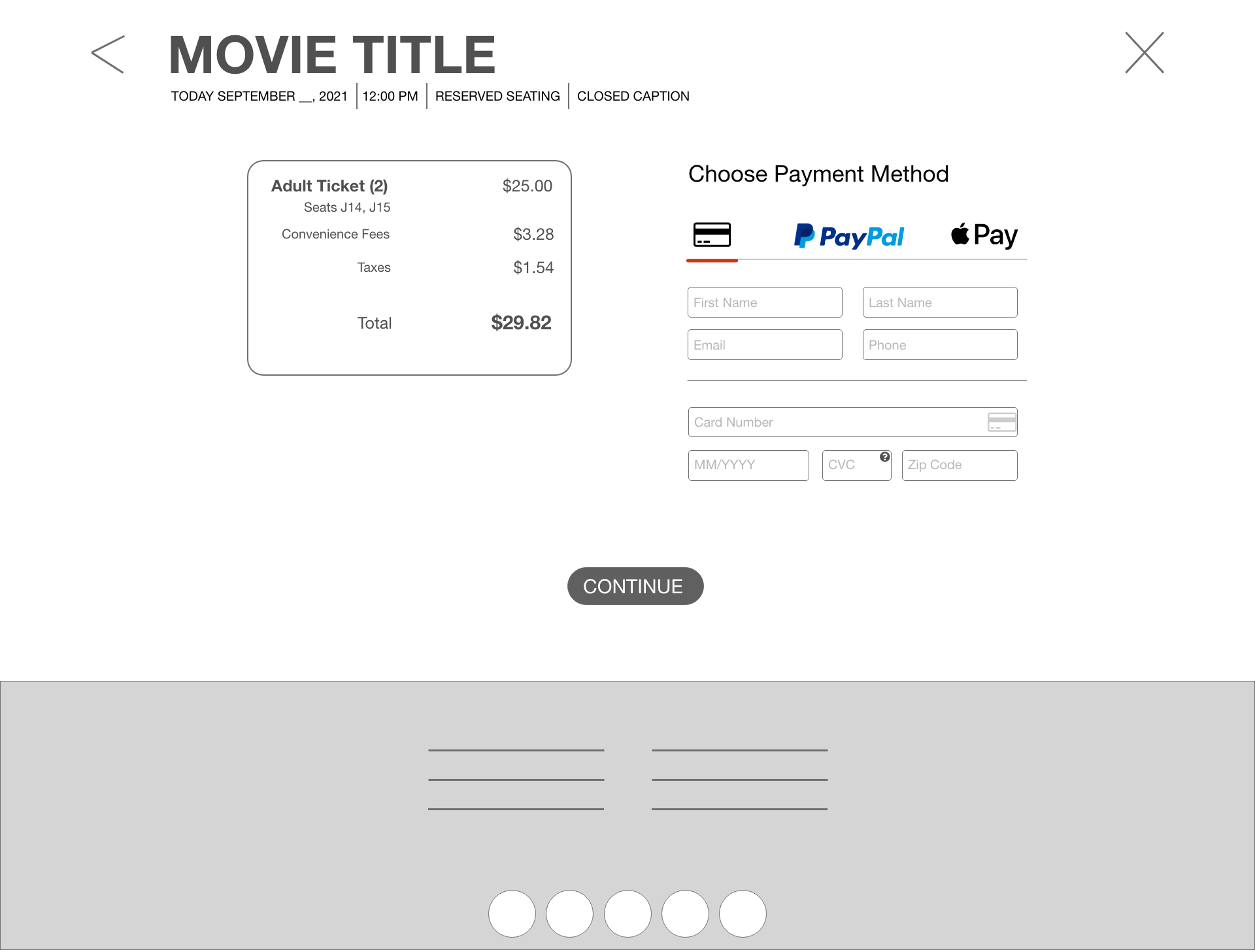
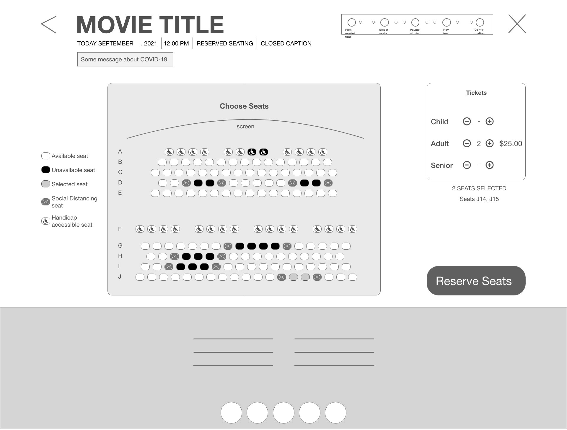
Trying to streamline the process further, I wanted to make a quick link to available food that can be either picked up at the counter at the designated time window or delivered to the user’s seat during the movie.
Low-Fidelity Prototype User Flow
USABILITY TEST FINDINGS
MOCKUPS
Version 1 of the mockups
Just as I had suspected, a large majority of those who were surveyed also felt the original colors of the designs were bland.
So I went back to the drawing board and gave the designs a new color palette while improving some of the little details that were pointed out by users.
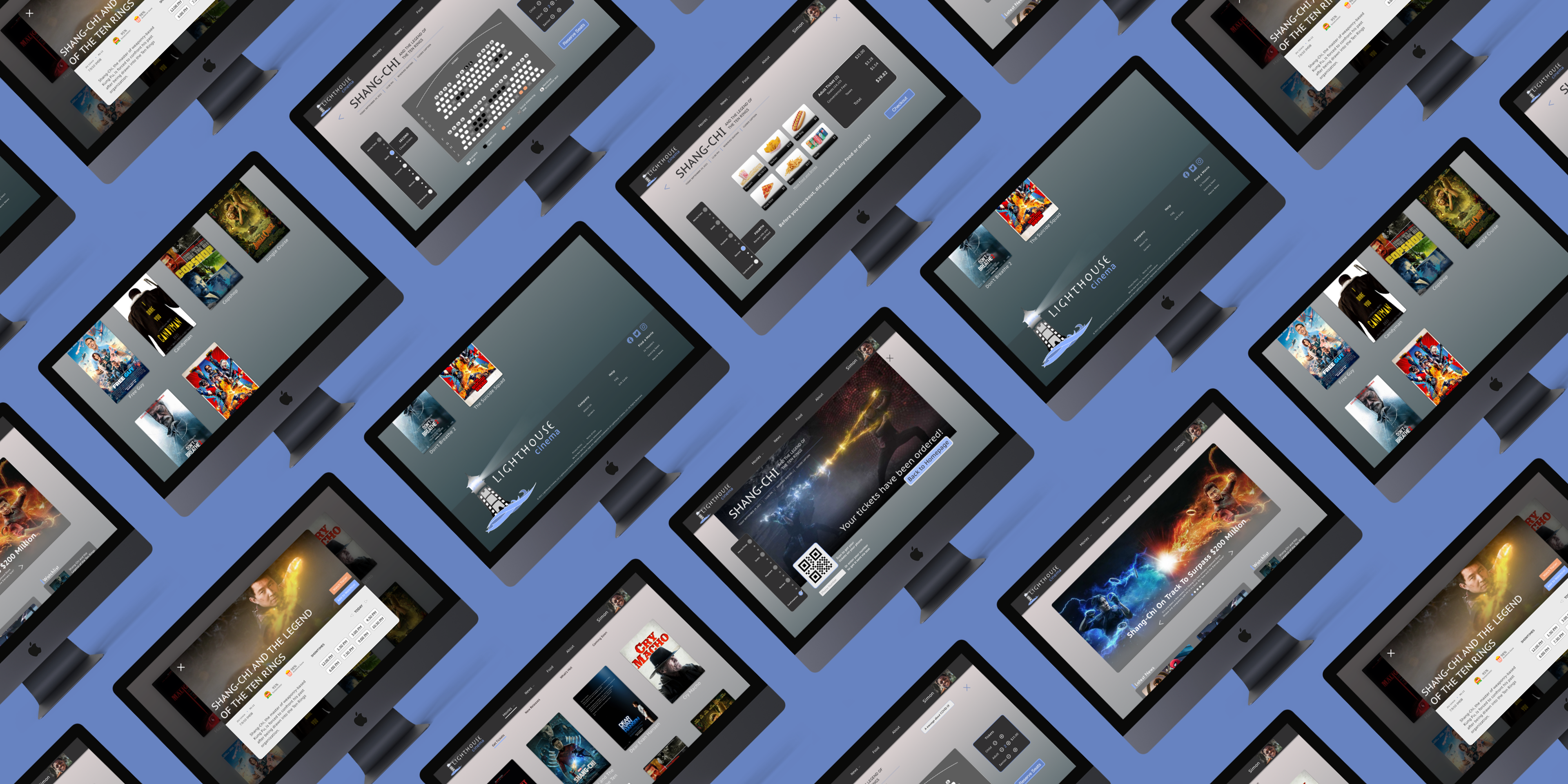
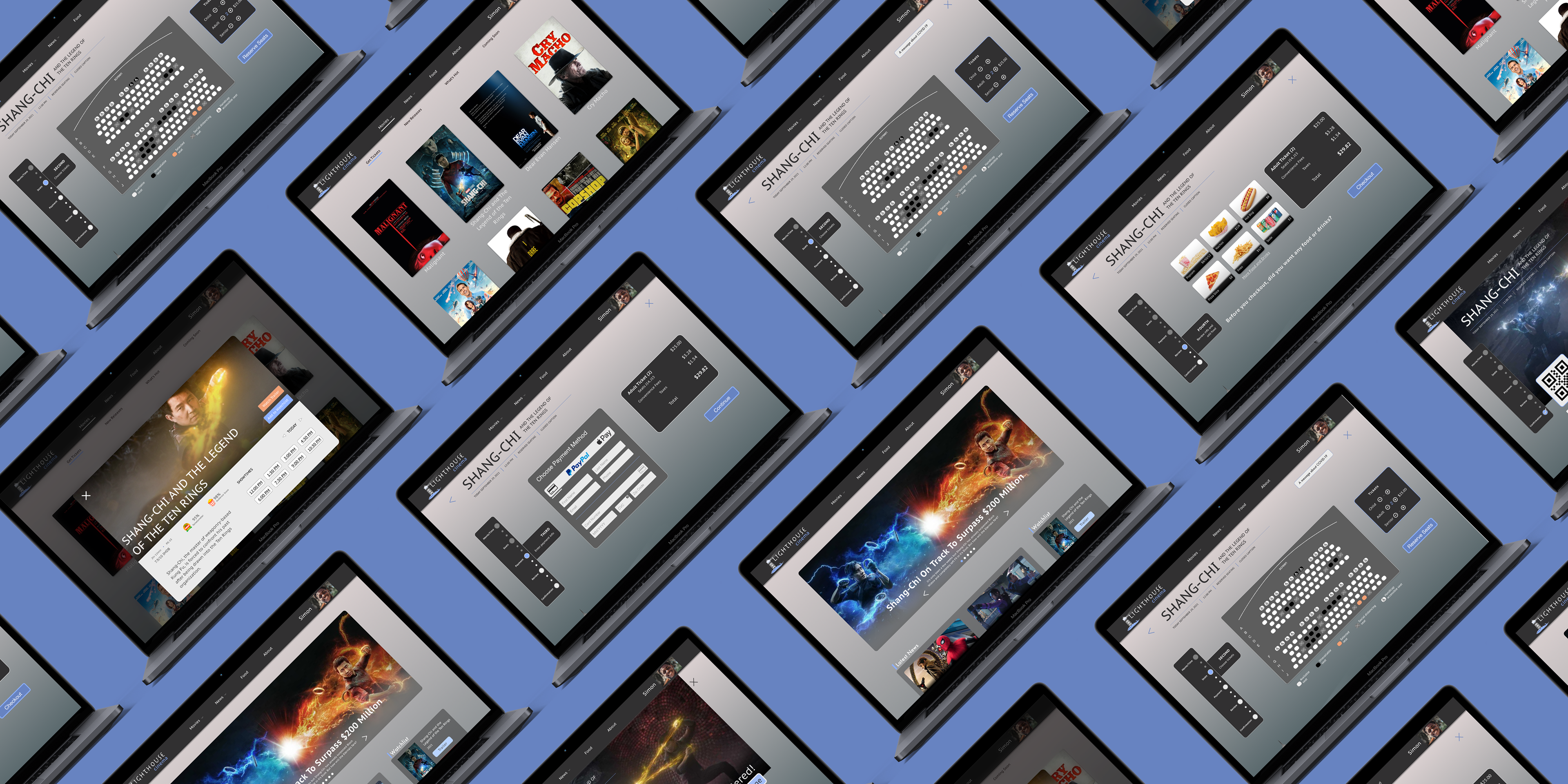
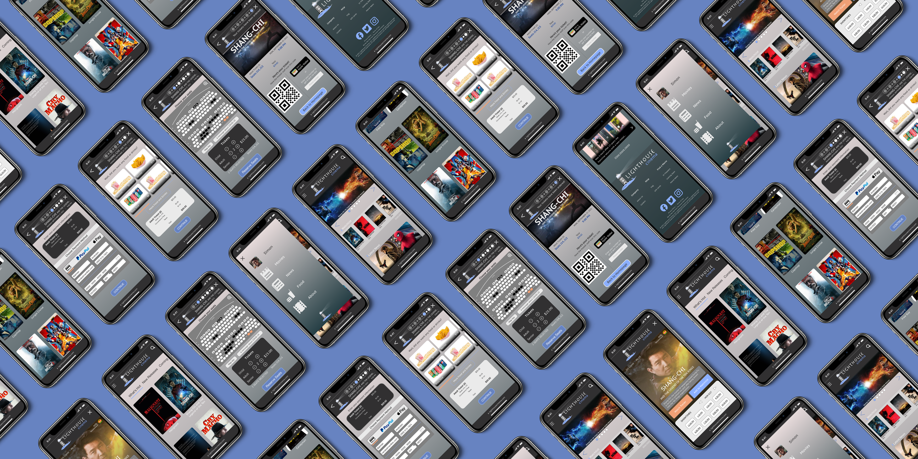
Current and improved version of the website
HIGH FIDELITY PROTOTYPING
The final version of the high-fidelity prototypes present a simple user flow that accomplishes the goal of reserving movie theater seats
CONSIDERING ACCESSIBILITY
Large icons, plenty of white (negative) space, and large text to make navigation easier
----------
High contrast layout for ease of reading
----------
Screen reader compatibility was added for those with limited vision.
Takeaways
The responsive website should allow users to complete the user flow quickly and without any issue or complication.
Plans For
FUTURE Sequel PROJECTS
Conduct more usability studies and user research to determine if pain points were truly met and if any new ones have popped up.
----------
Further refine the layout and UI of the website to aid in navigation, appearance, and accessibility.
----------
Refine the design of the food and seat selection sections to match with modern design standards.

