
Role
UX designer designing an app for P3 from conception to the final product
Tools
Figma
Problem
When users get pregnant, try to start a family, or need to raise a child, some get confused by misinformation and some can feel alone. The stress and anxiety of dealing with parenthood affects many users.
Goal
Create a tool to help first time parents get verified information and find people to connect to. Have a way to support users emotionally when they are feeling less stable about parenthood or pregnancy
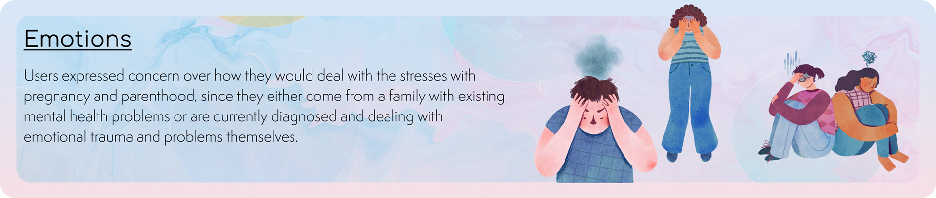
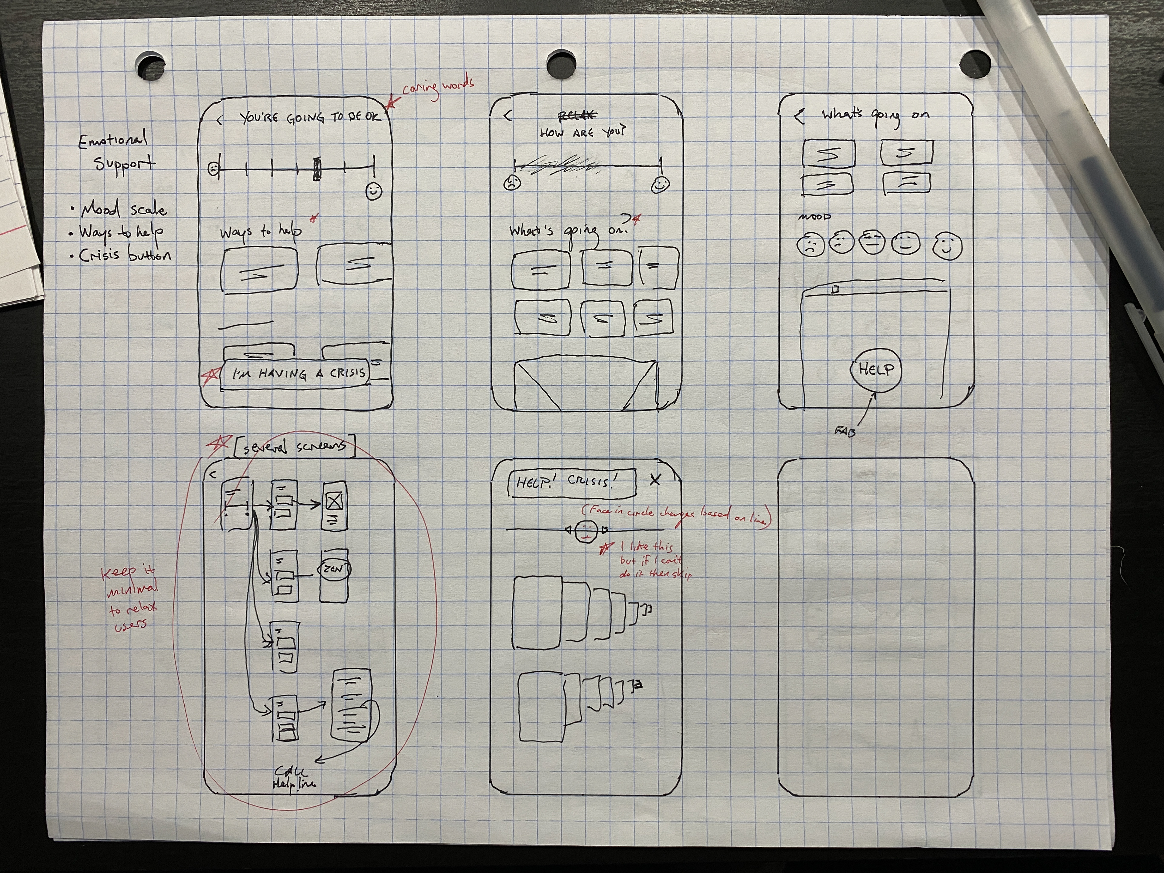
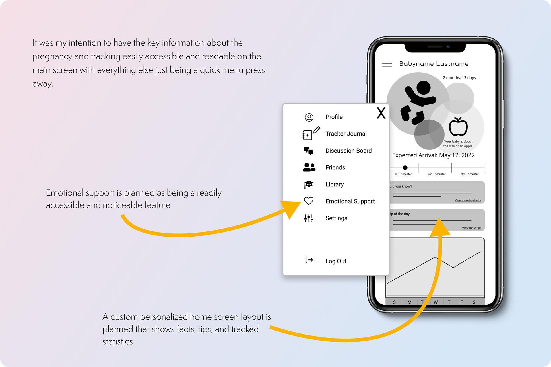
A primary user group identified through research were users who have not had children yet, but wanted to in the future. They expressed a distinct concern over what possible emotional stresses would happen when pregnant. This led to an increased emphasis on the Emotional Support section of the app and website.
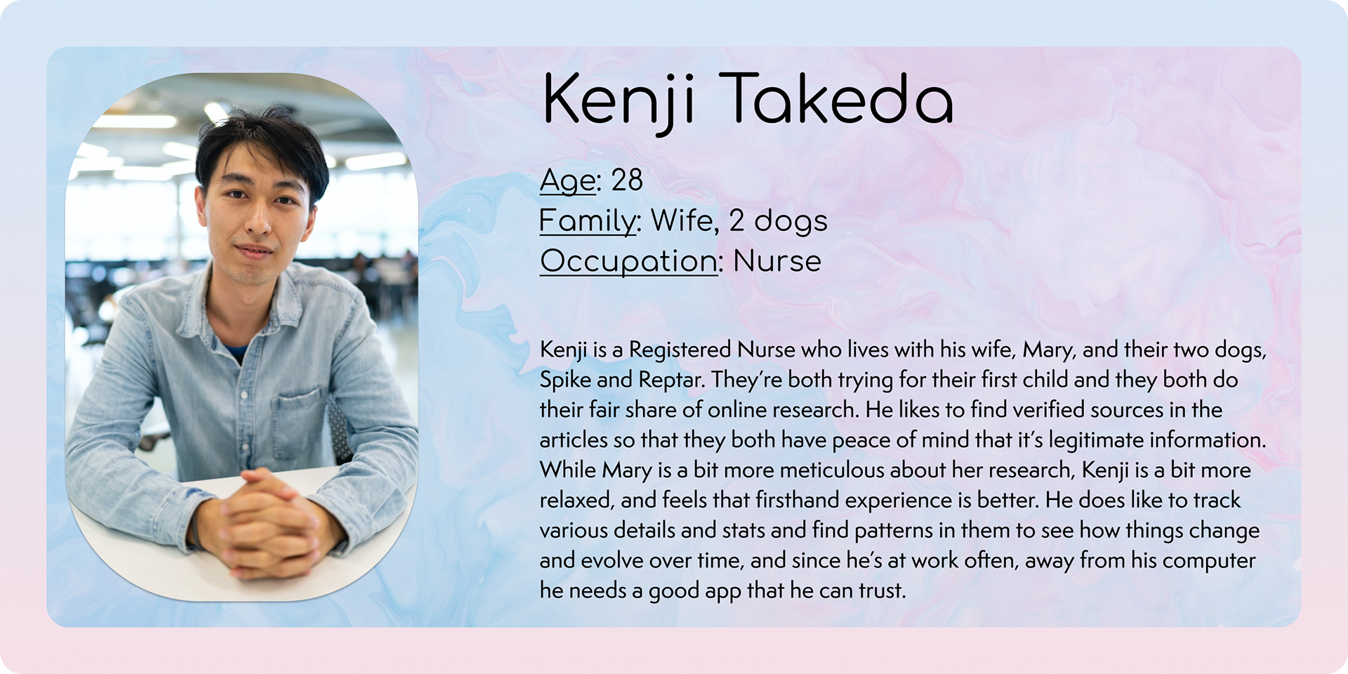
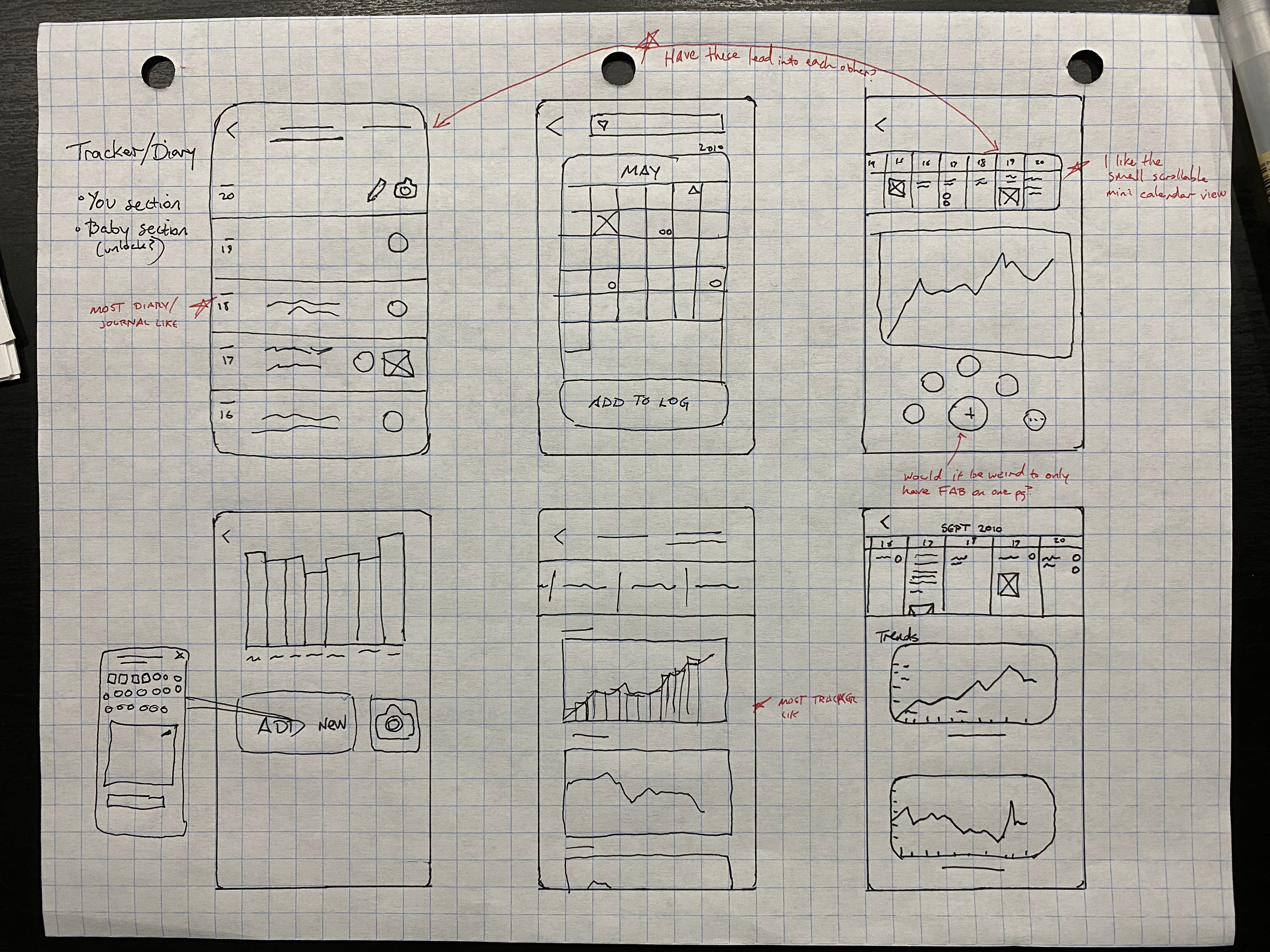
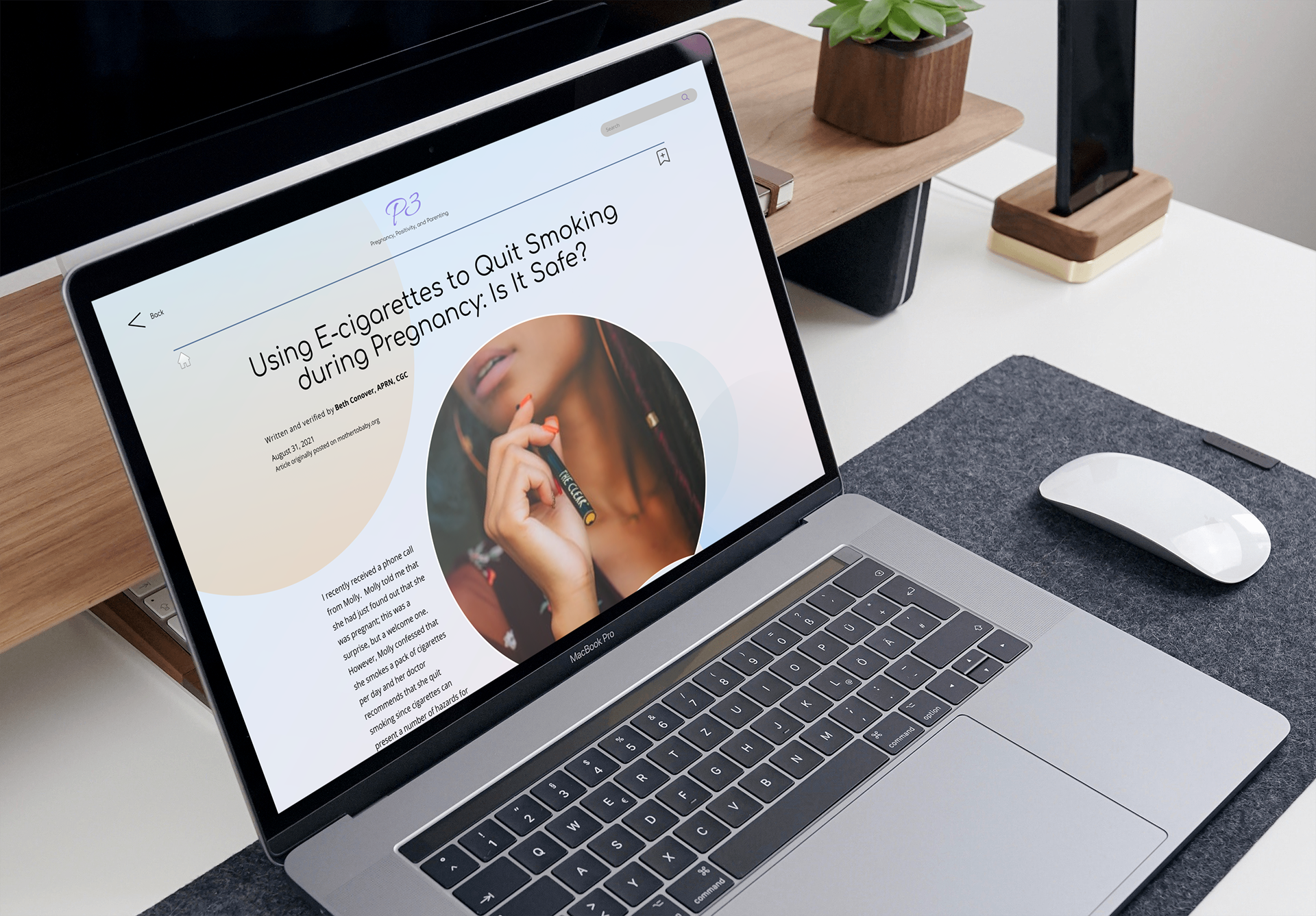
A secondary user group interviewed were users who have already had a child but the question was flipped and they were asked what information they found valuable or would have wanted in the past when they were pregnant. This revealed the importance of tracking key statistics during pregnancy and even after birth, and also the importance of professionally verified accurate information due to being confused and irritated by contradicting and inaccurate info.
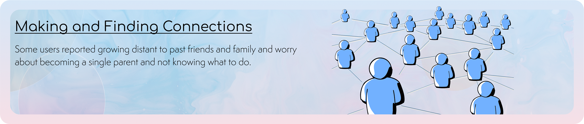
Pain Points

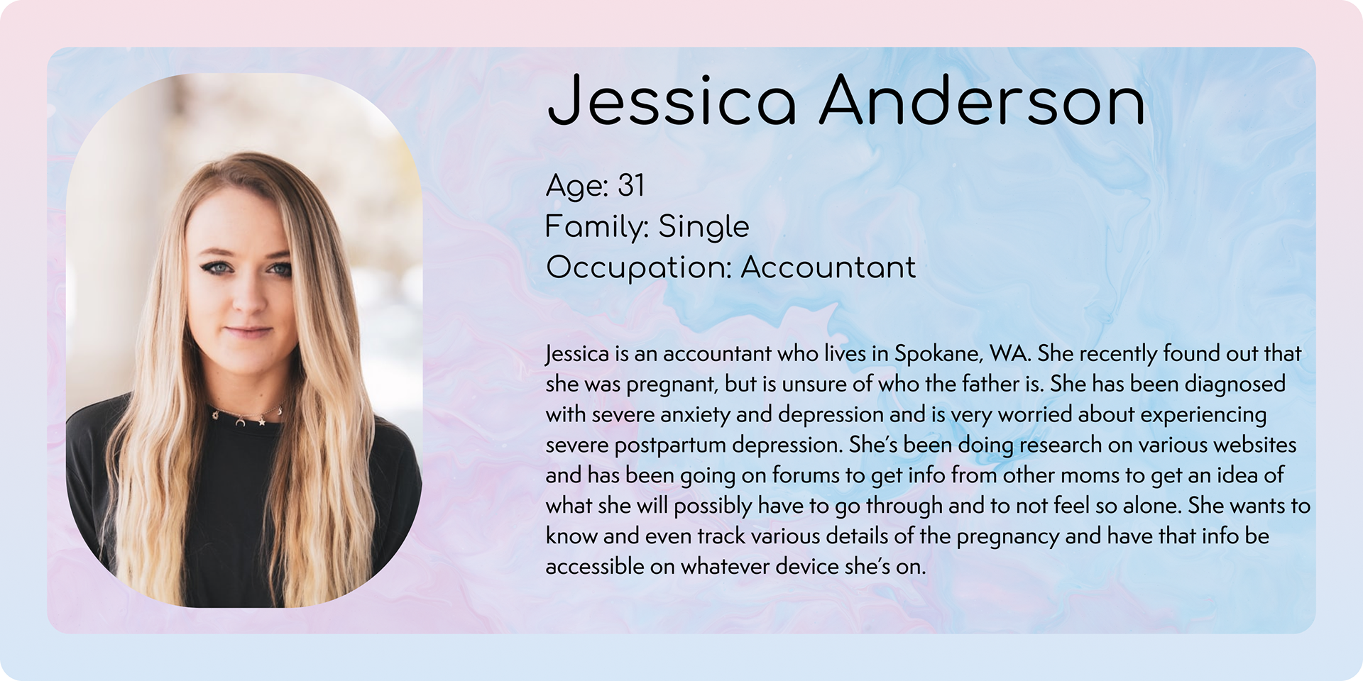
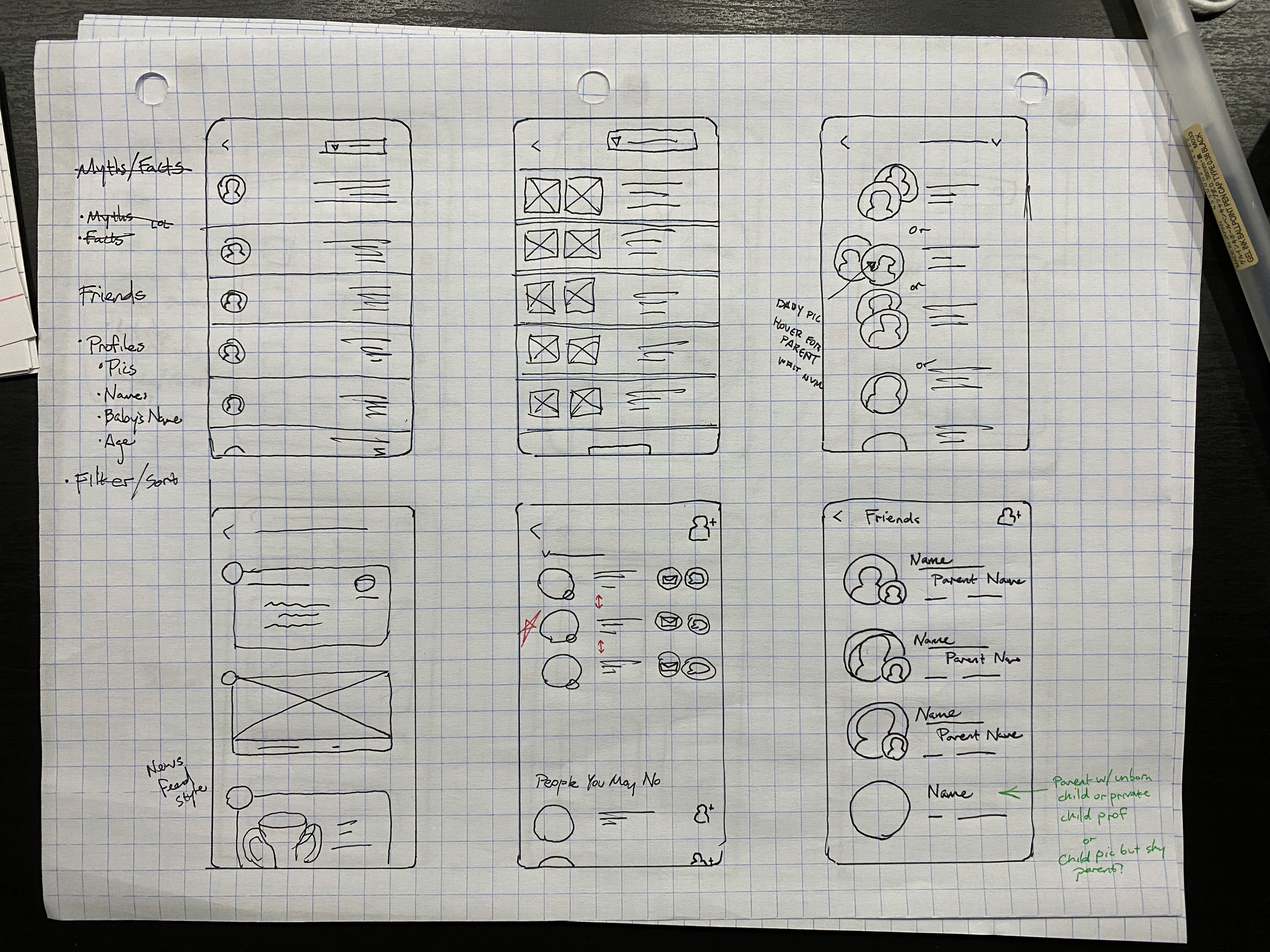
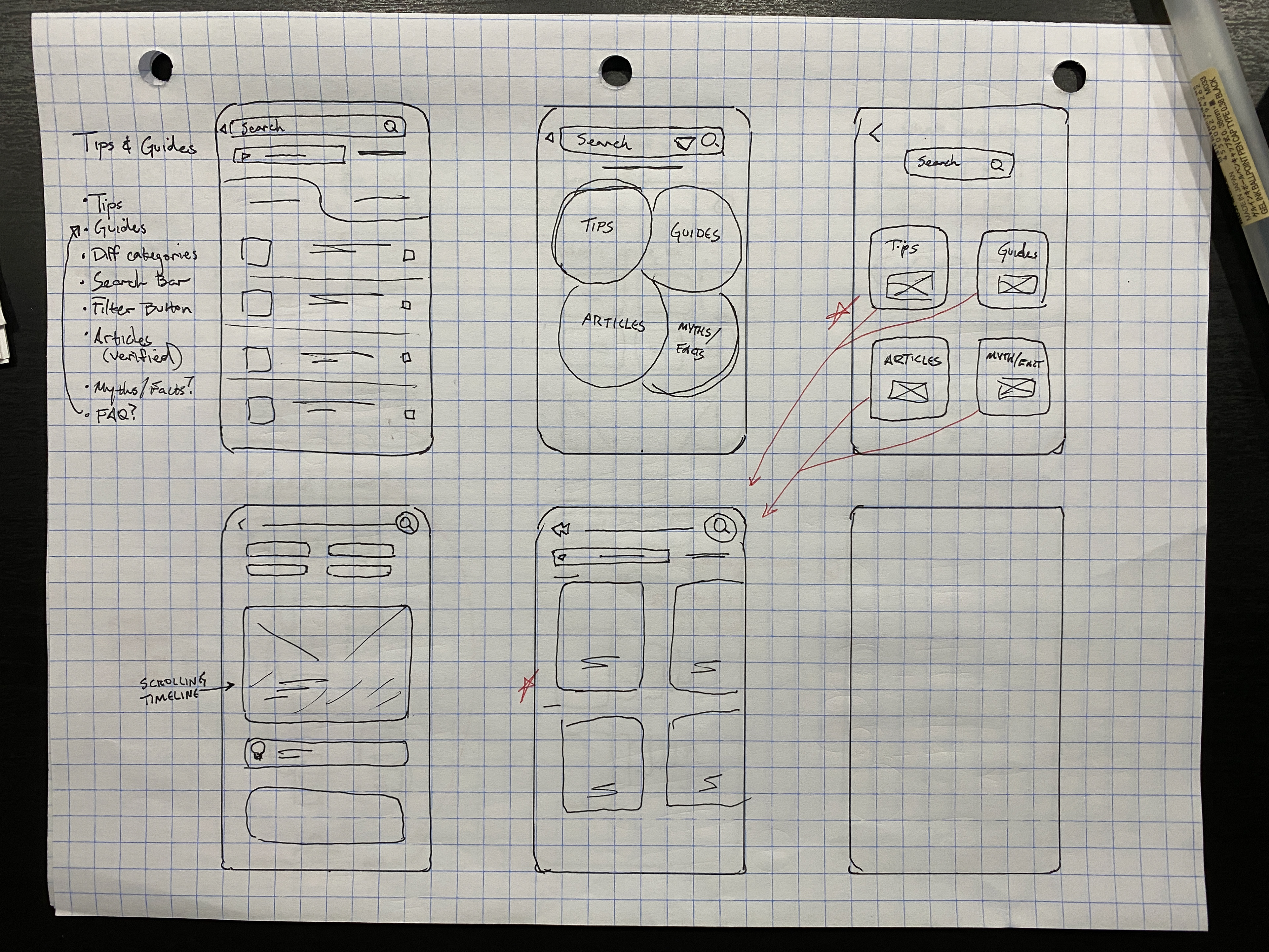
Meet the (Future) Parents
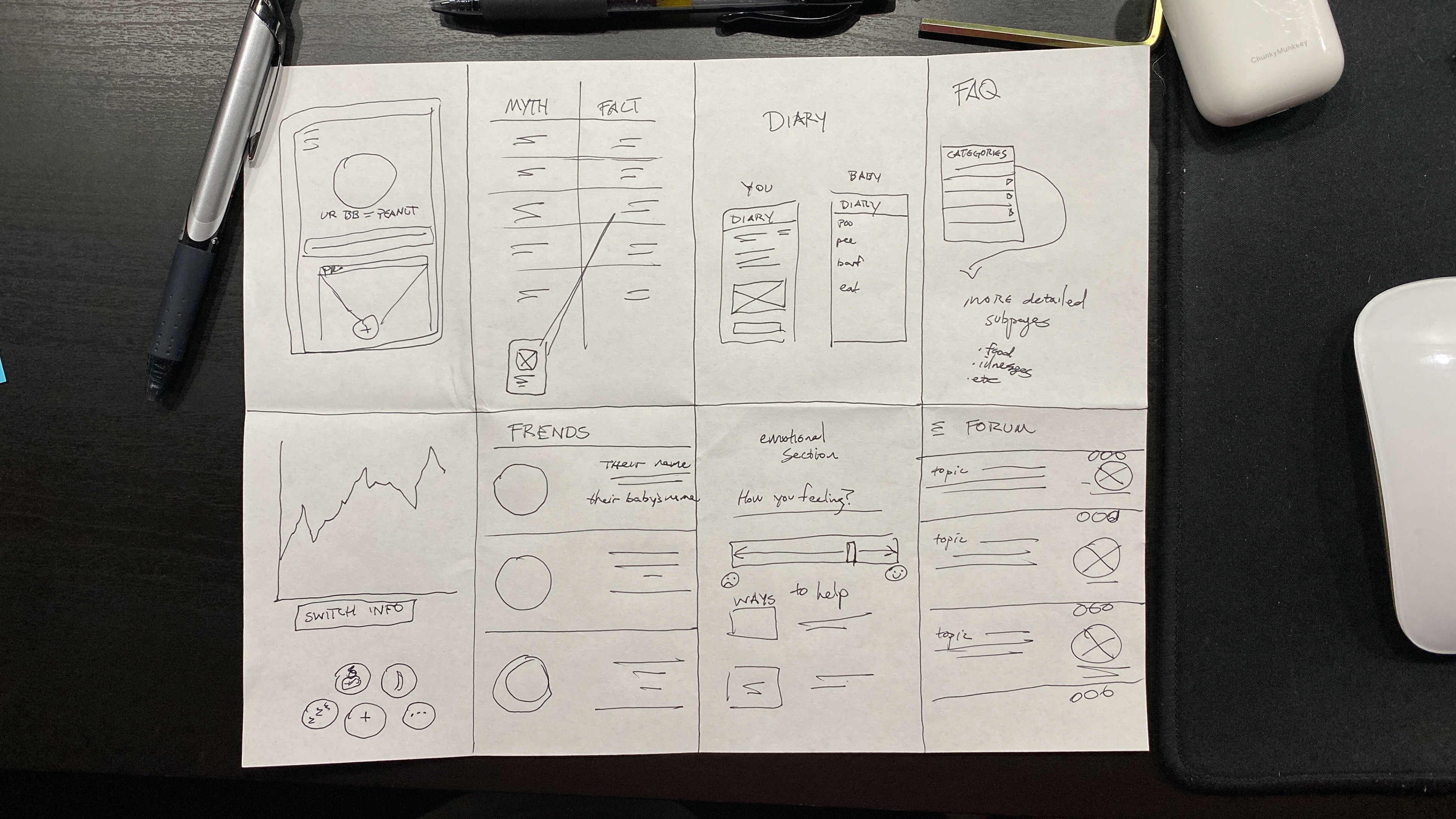
Ideation
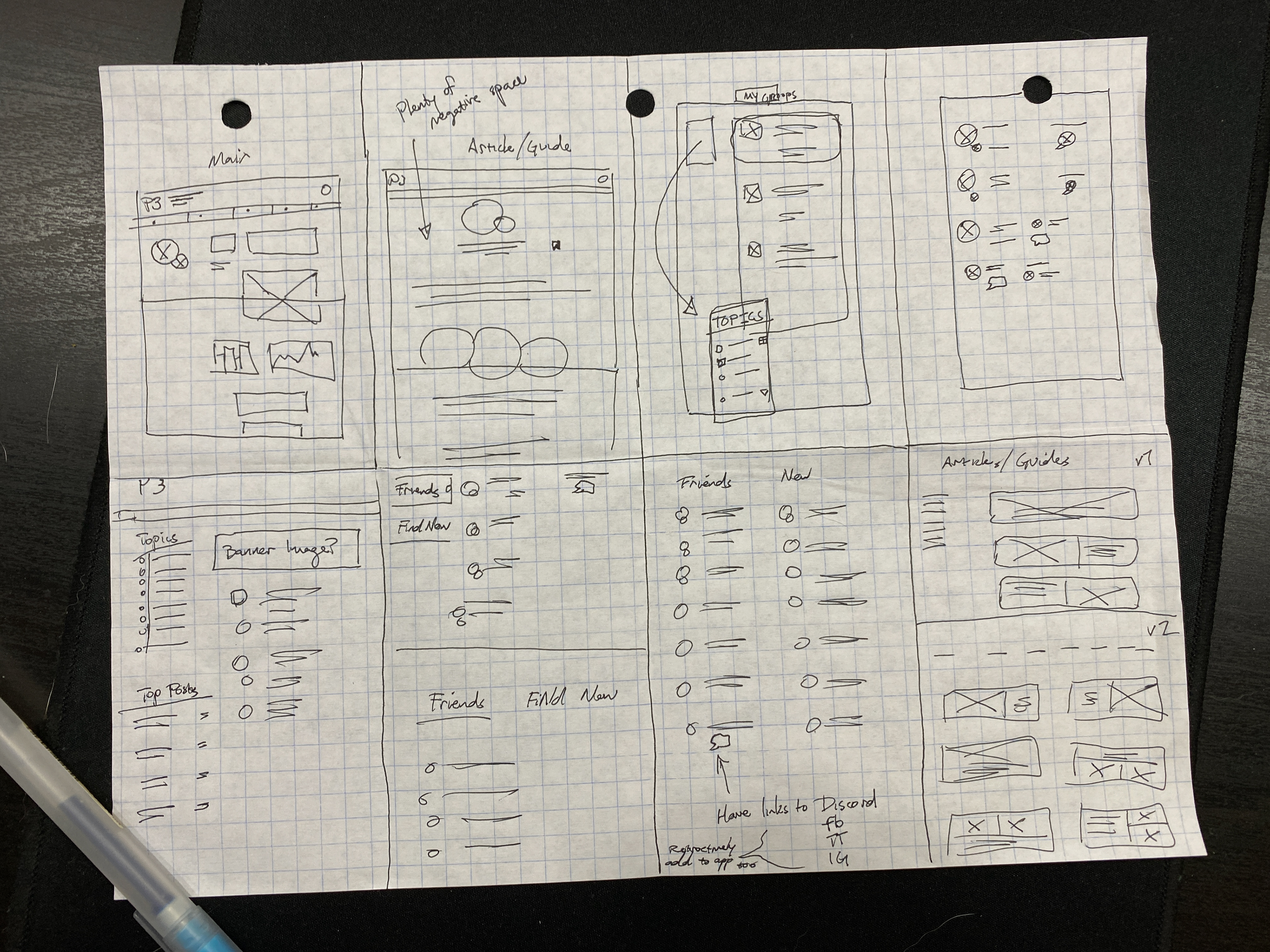
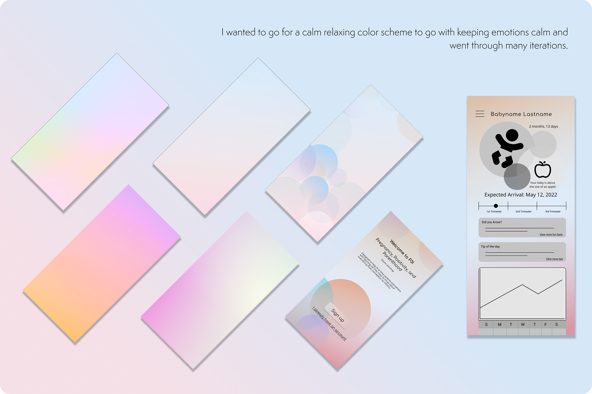
Many iterations of possible layouts were drafted for various screen sizes. They were all specifically made to address both user’s pain points.
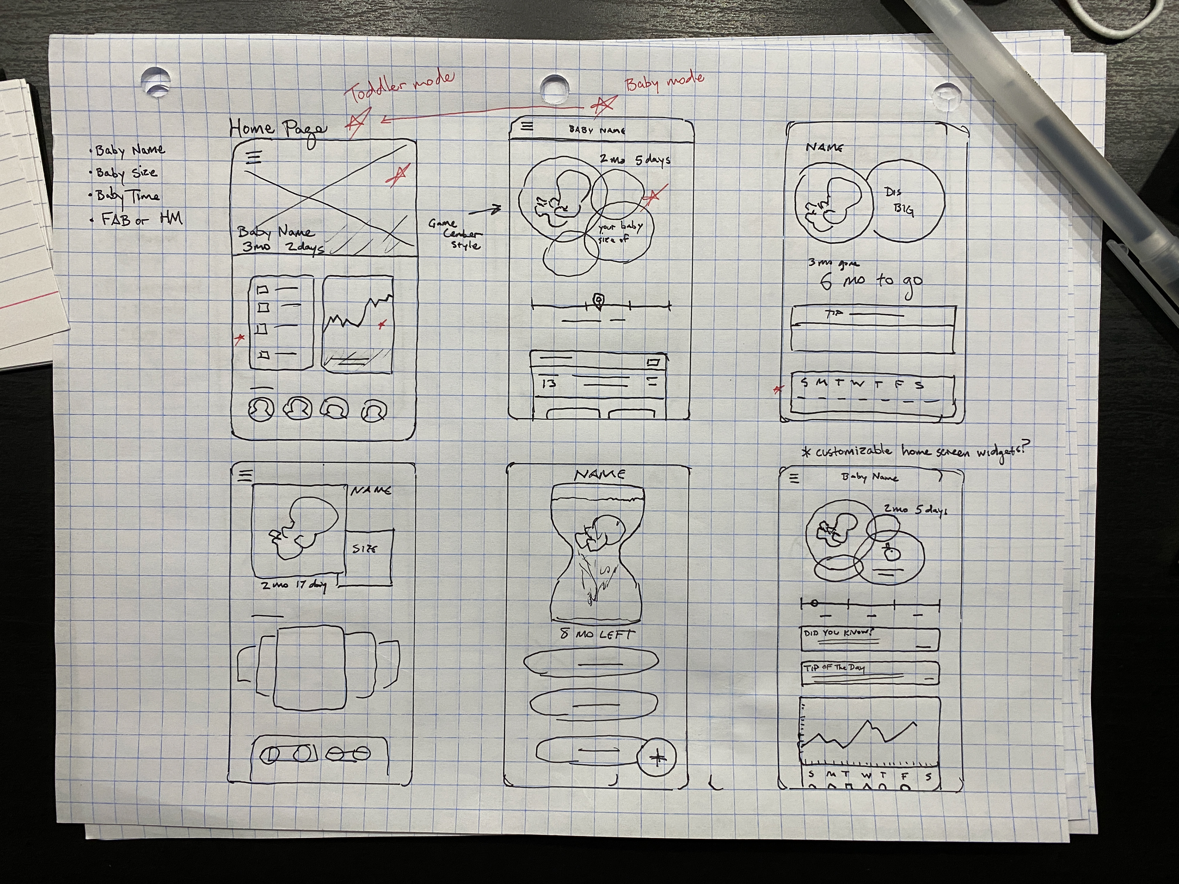
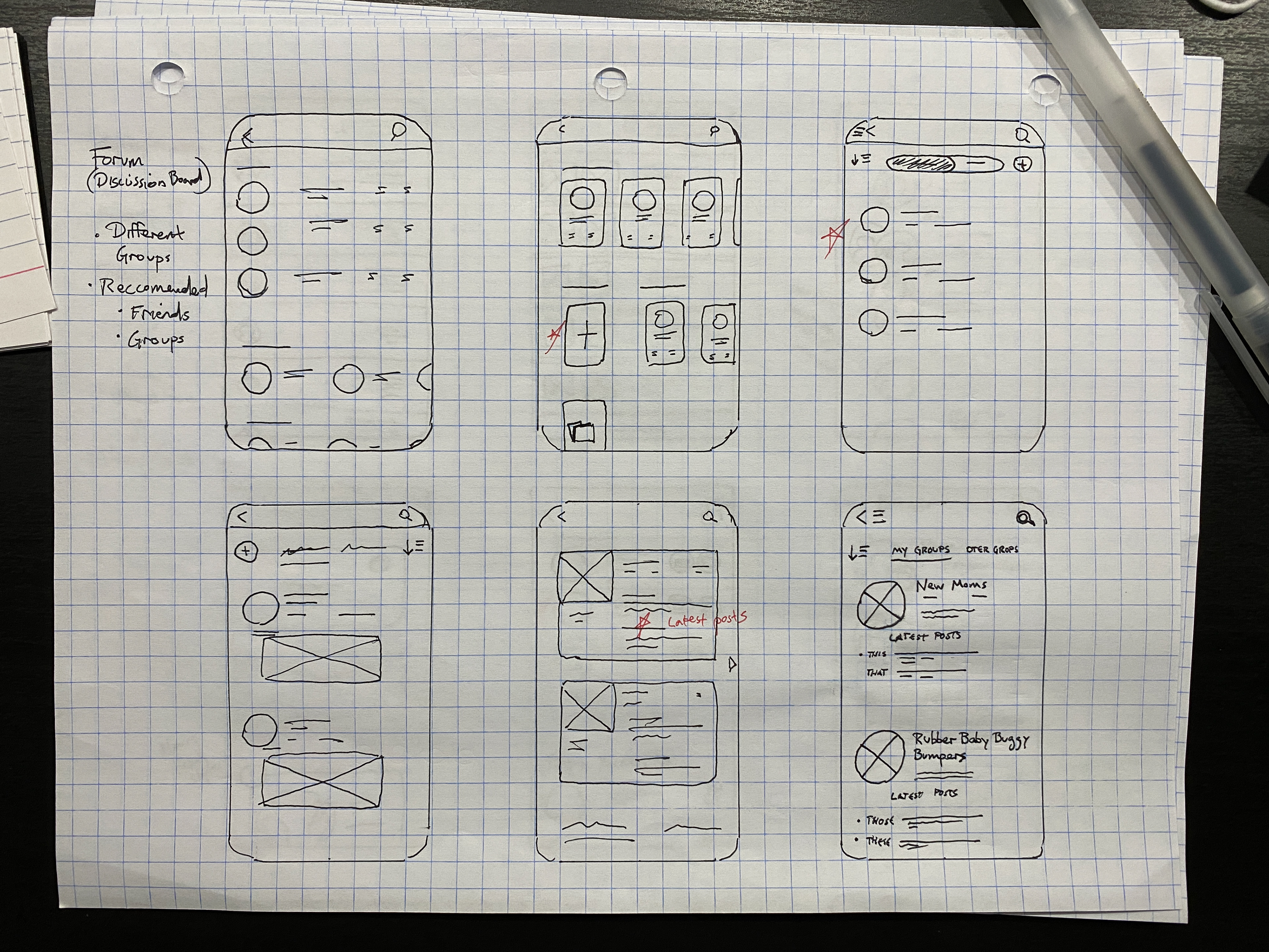
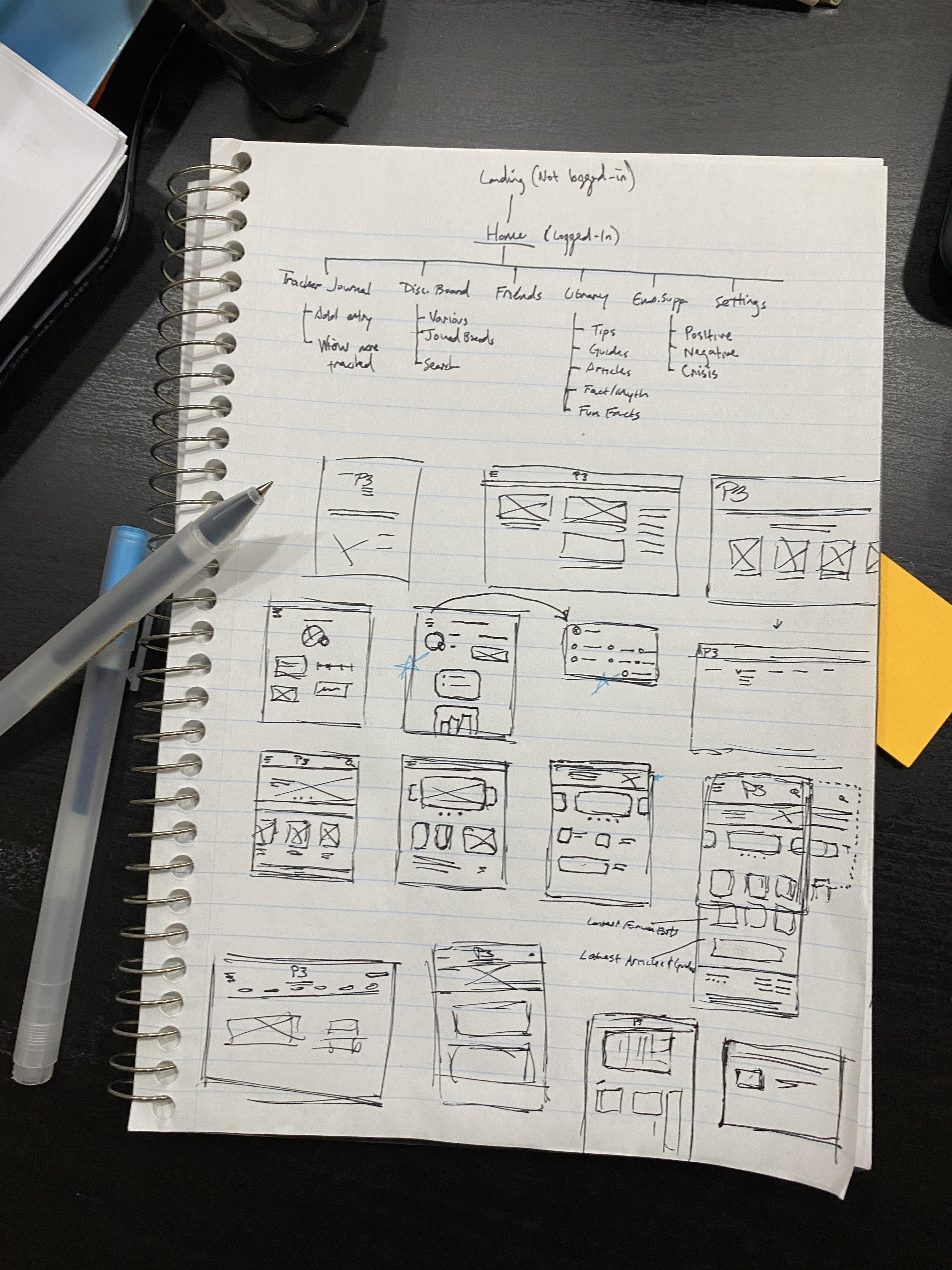
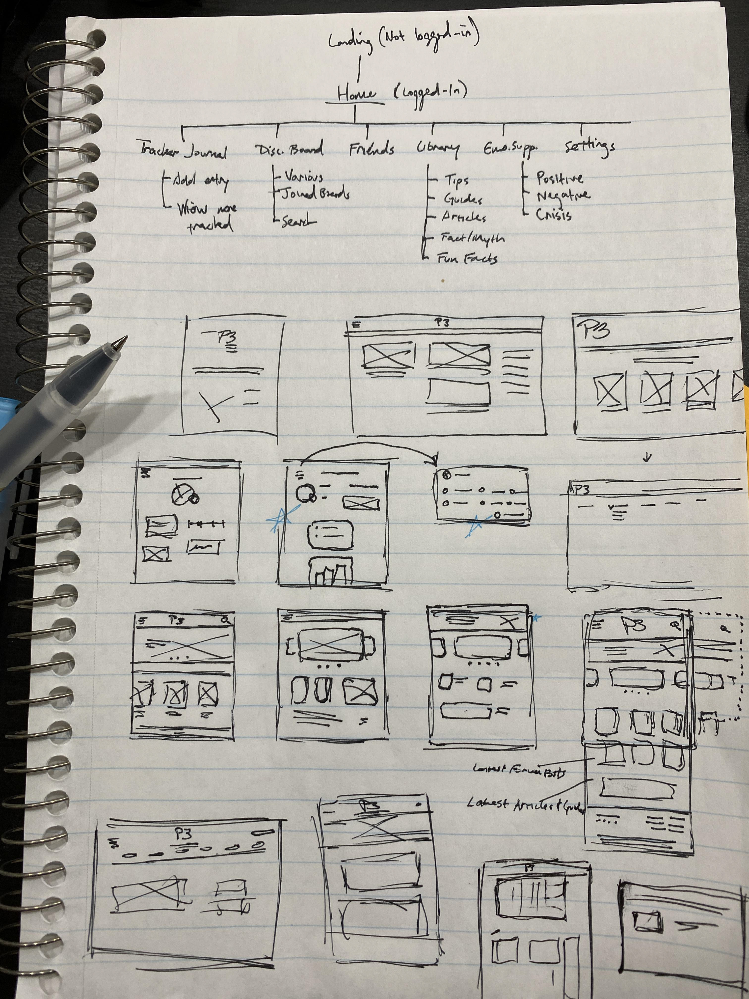
Digital Wireframing
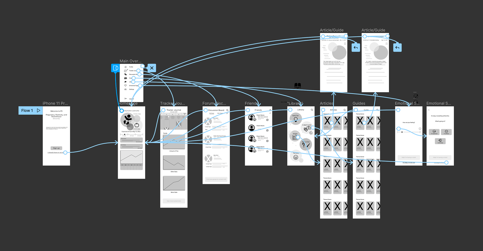
Map of prototype's user flow
Animated Icons


Usability study results
1. Users thought the bubbles were “disjointed” and disliked the layout
2. Users appreciated the inclusion of the emotional support section
3. Users wanted the due date to be listed next to the length of the pregnancy.
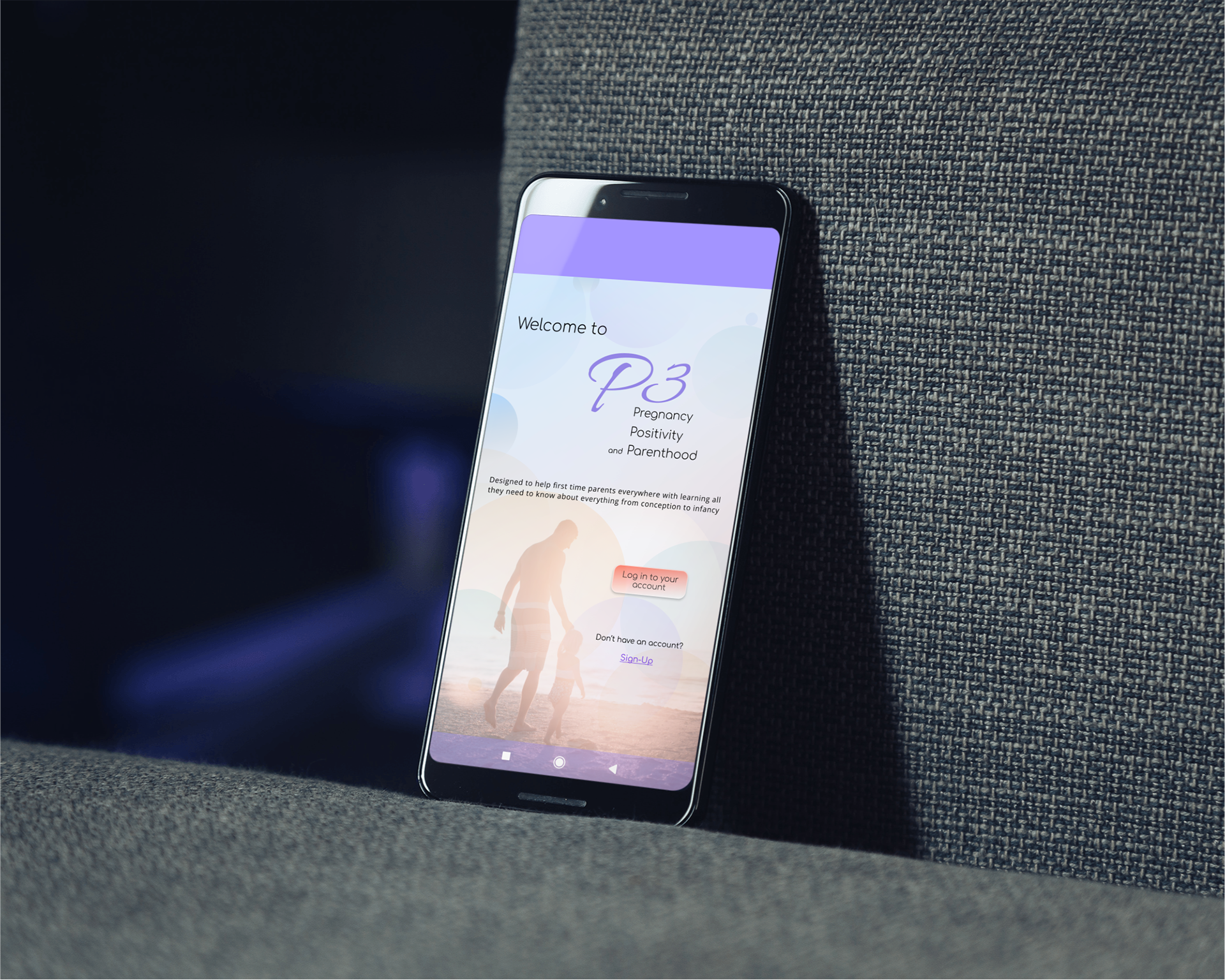
High-Fidelity Prototypes
The final version of the high-fidelity prototypes present a user flow that looks complex but is actually easy to use
They also met user needs by having clean interfaces, presenting the accurate information that is clearly verified, and has methods for users to connect with each other.
Accounting for accessibility
Large icons, some animation, and large text to make navigation easier
An option to tap the tabs instead of swiping was added for those who may have physical disabilities.
Screen reader compatibility was added for those with limited vision.
Takeaways
This app lets users not only feel informed and connected to others, but it helps out anyone who is feeling emotionally broken, alone, and lost, by giving them words of affirmation and resources to connect to.
While designing P3, I learned how important it is to really put yourself into the users’ shoes to understand how they feel. The emotional aspect of the project was something I did not even think much of in the beginning, but grew into a key part of the project.
What's Next
Add more resources of information about pregnancy and parenthood to fully flesh out any situation that might pop up
Conduct more usability studies and user research to determine if pain points were truly met and if any new ones have popped up
Refine the Emotional Support section to provide more feedback and resources. Possibly put in AI chatbot to talk to and have conversations with.