
What's the problem?
Ohana House has been struggling to get business ever since COVID-19 happened. They do not have an app to help with convenience and brand awareness.
What's the goal?
Create an app for Ohana House to help increase amount of business they conduct.
Role:
UX Designer, UX Researcher
Tools:
Figma, Adobe Photoshop

interviews were conducted.
empathy maps WERE created.
users' needs were understood.
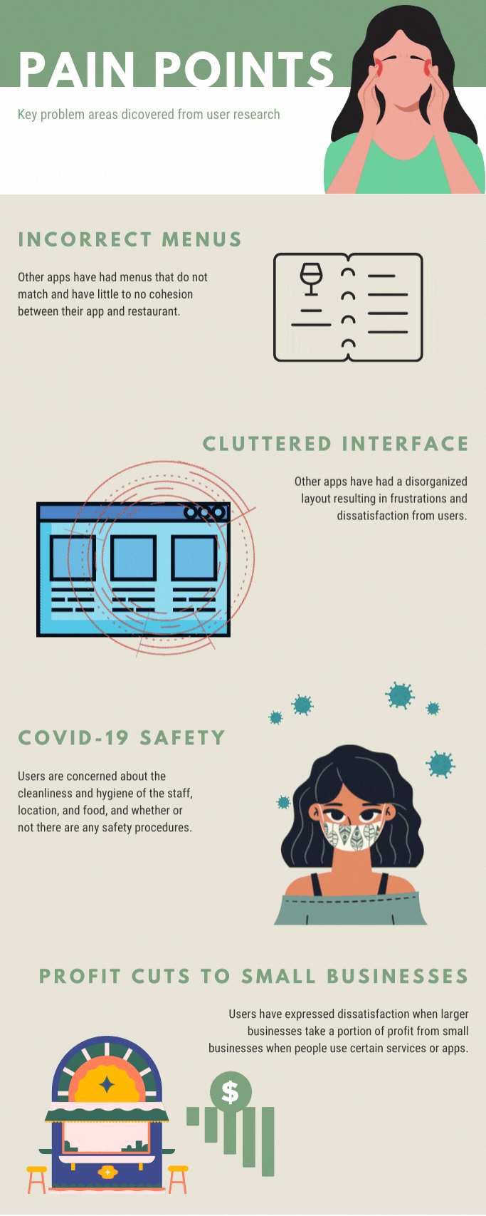
A primary user group identified through research were local users already familiar with Ohana House. They like to support small, local businesses, but have trouble doing so when those businesses have incorrect menus that don’t match up or disorganized and cluttered menus. They are also aware of the changes that coronavirus has done to everything, including food and restaurants. Users try to stay safe and need to know that the local restaurants are as well.
With that in mind,
Meet the Personas
Representations of two key user demographics

Terra Yung
Age:
27
Family:
Single, mom, dad, two sisters
Occupation:
Freelance Photographer
Terra is a free-spirited photographer in Honolulu. She loves the island culture and food. Living on an island disconnected from the mainland, she's come to appreciate the small family run businesses over the years. She's since vowed to only support smaller run places instead of going to places run by large companies and they make sure their money is going all toward the smaller businesses. She get frustrated when the layout of apps are hard to read and use. Ever since COVID-19 happened, she has been very cautious of it, and needs to make sure places are taking extra precautions to sanitize and be clean.
Thomas Montéz
Age:
33
Family:
Single, lives with two cats
Occupation:
Insurance Salesman

Thomas is an insurance salesman who lives with his 3 cats. They have decided to vacation in Hawaii. They are island hopping and they are now coming from Maui to Oahu. They’ve come to enjoy Hawaiian food a bit, but they are still a little picky when it comes to some of the more local dishes. It frustrates them when they notice places where the menus don’t match up to what’s online, and when descriptions are lacking on food items.
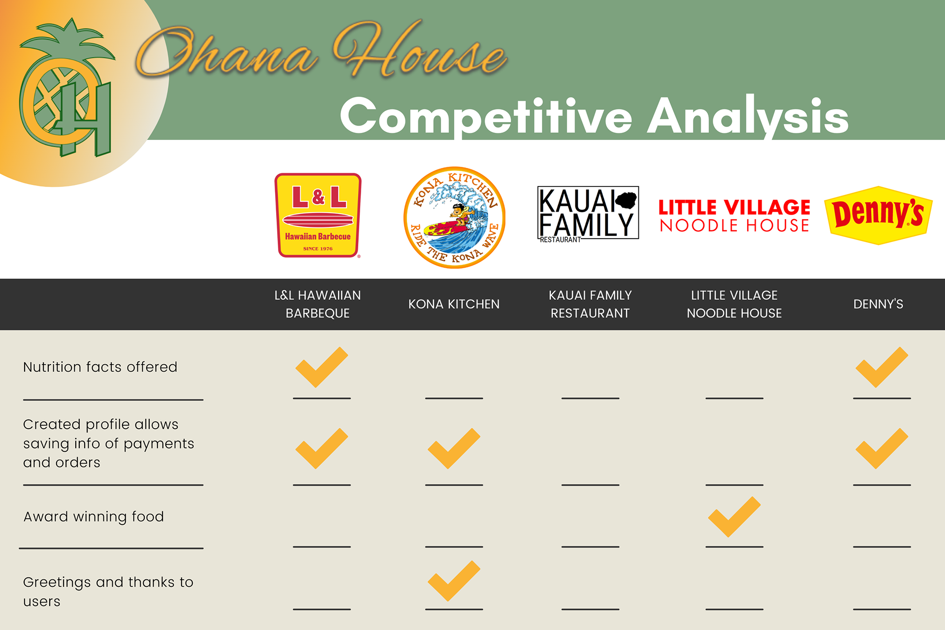
The key competitors are L&L Hawaiian BBQ, an international fast-food Hawaiian chain, Kona Kitchen, a smaller company with only a handful of locations, Kauai Family Restaurant, a small family Hawaiian restaurant with only one location, Little Village Noodle House, an award-winning Chinese restaurant, and Denny’s, a well-known worldwide diner chain.
You may have noticed that Kauai Family Restaurant doesn't have any check marks. While, yes, they didn't have the same features and offerings as the other restaurants, they are a small family restaurant with only one location just like Ohana House. We have similar offerings so they are still considered a direct competitor.
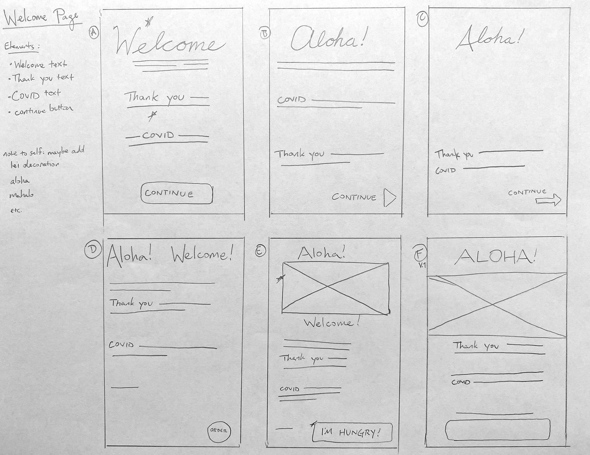
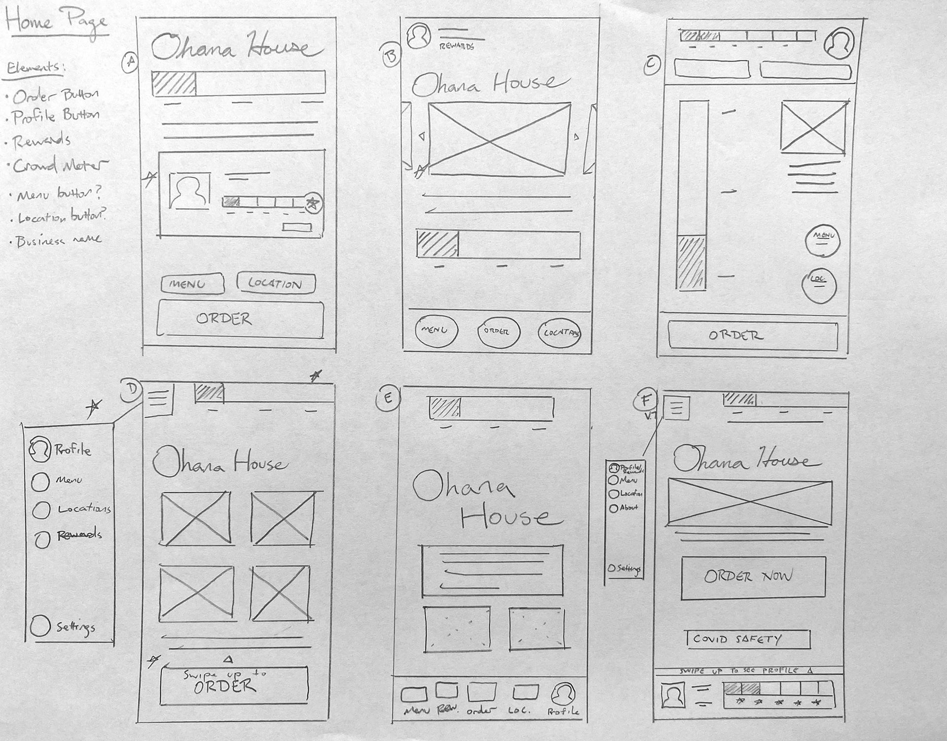
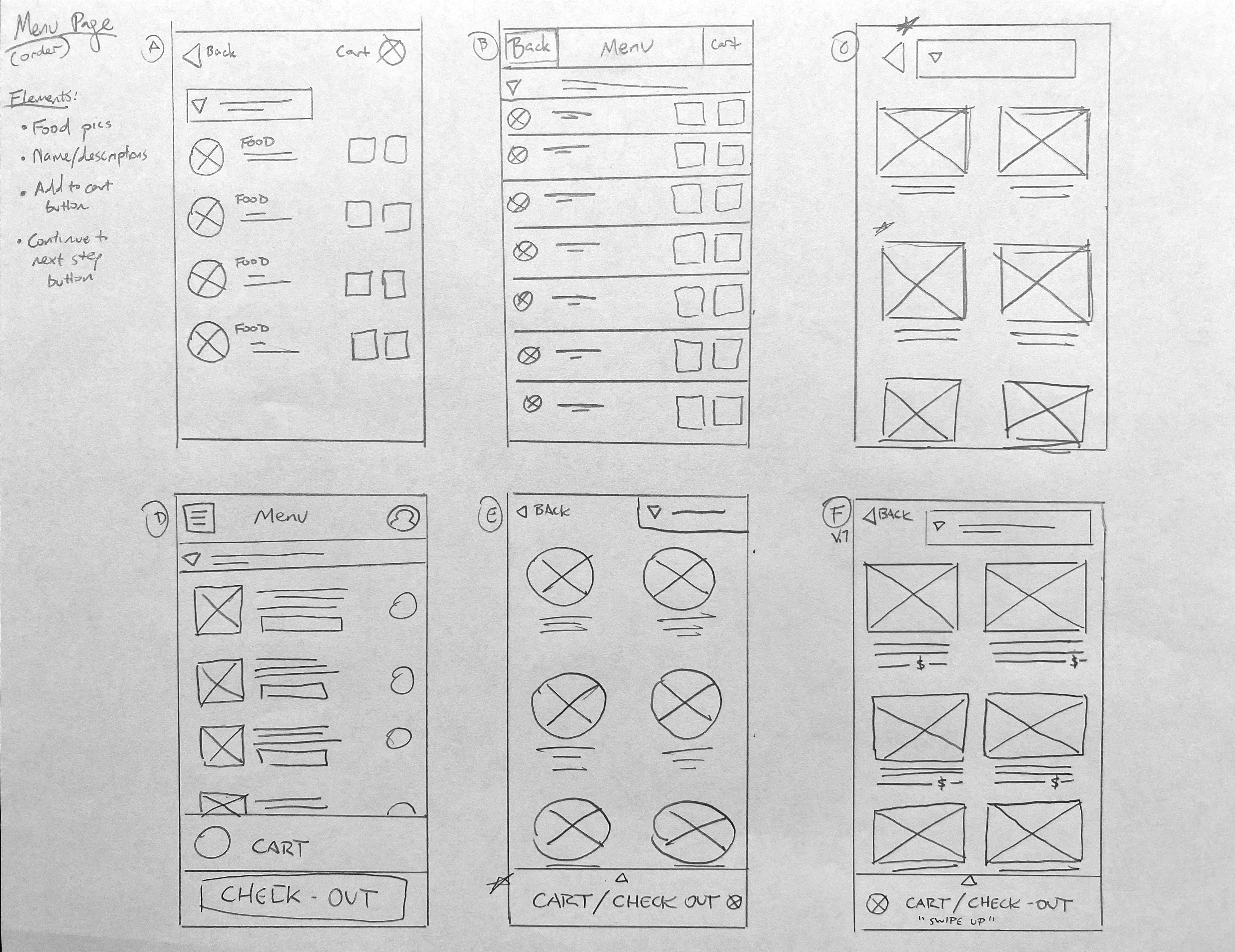
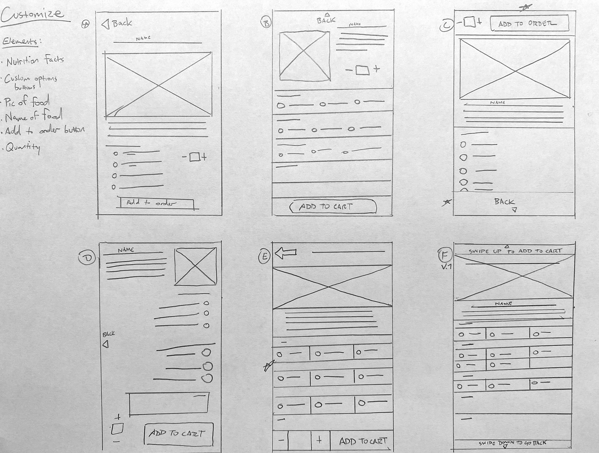
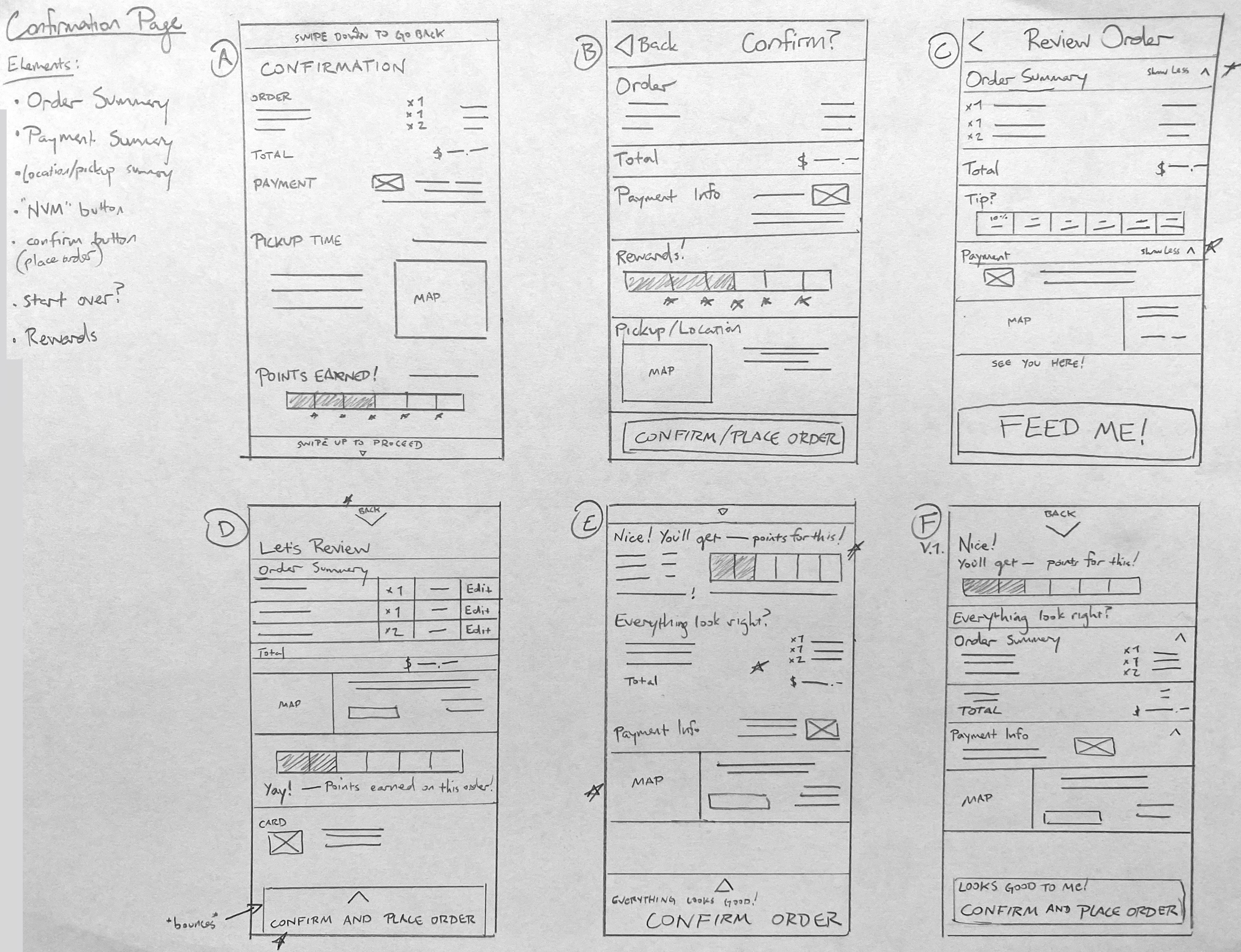
Paper Wireframes

Digital Wireframes
and
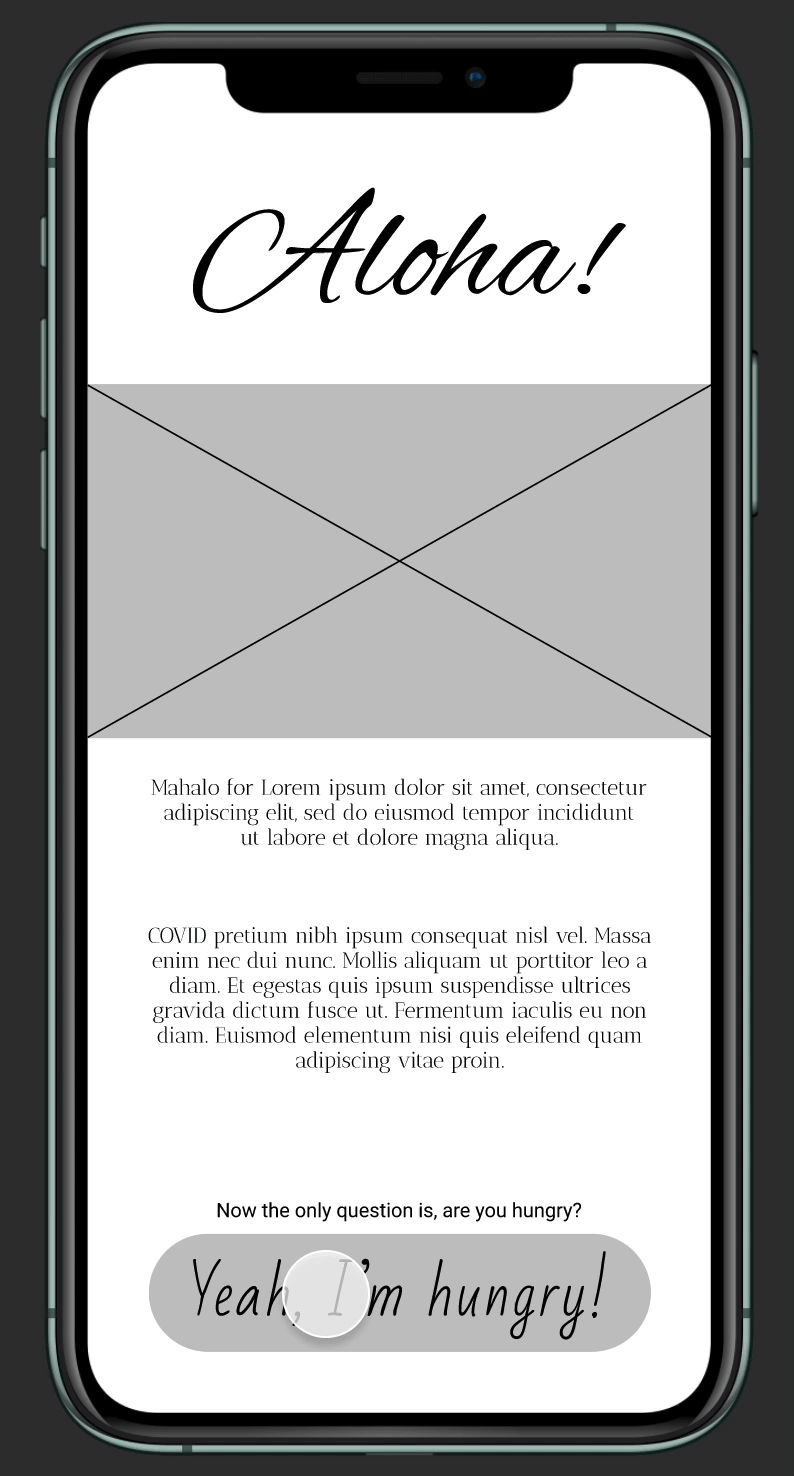
Low Fidelity Prototype
It was my intention to have the main button for the user flow to be easily accessible and noticeable while also having access to other information quickly without being too overwhelming.
The low-fidelity prototype connected the primary user flow of placing, customizing, and completing an order so the prototype could be used in a usability study with participants.
Feel free to try out the low-fidelity prototype here.
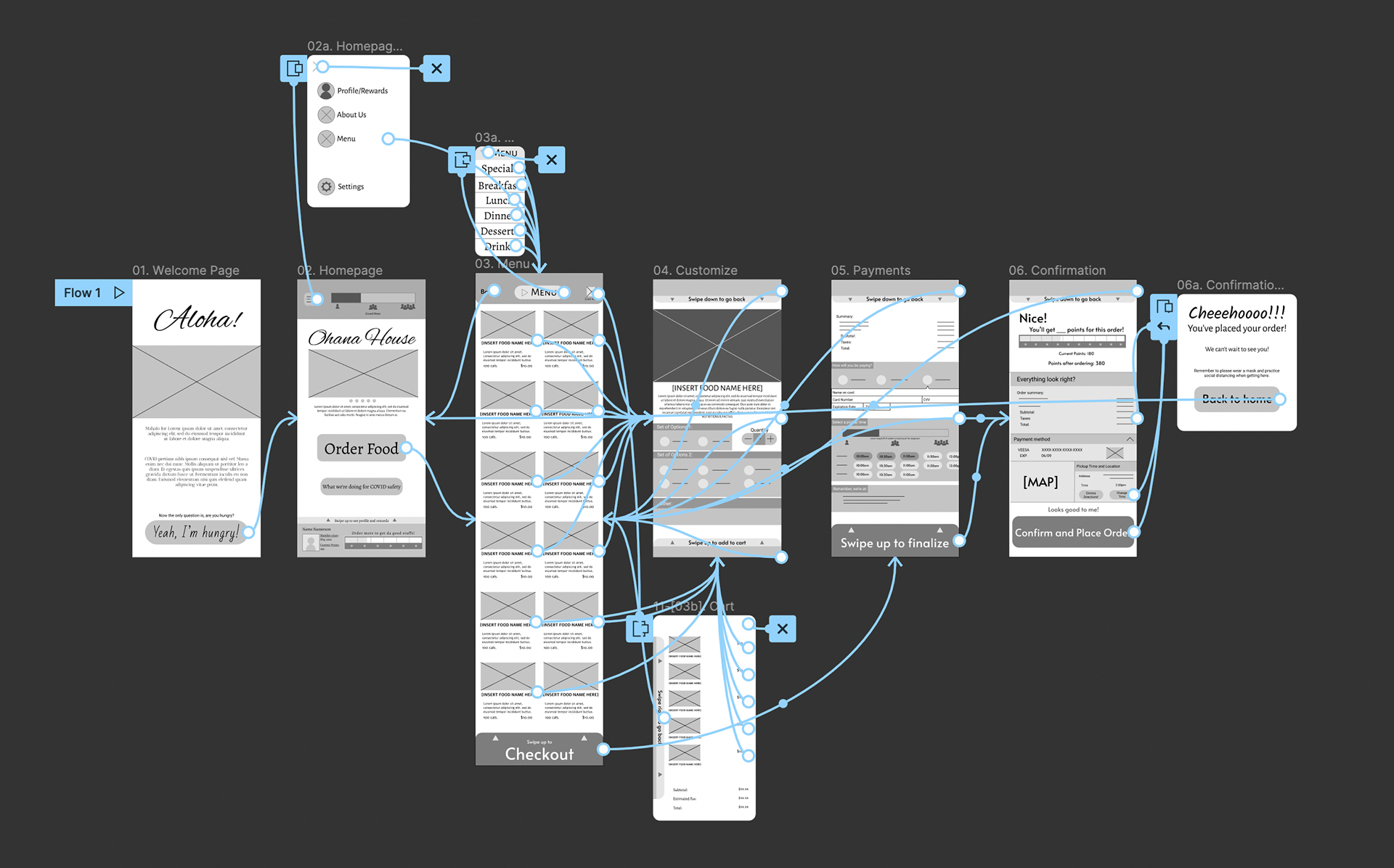
Map of the user flow
USABILITY TESTING
I conducted two rounds of usability studies. The findings from the first study helped improve the wireframes when mockups were designed.
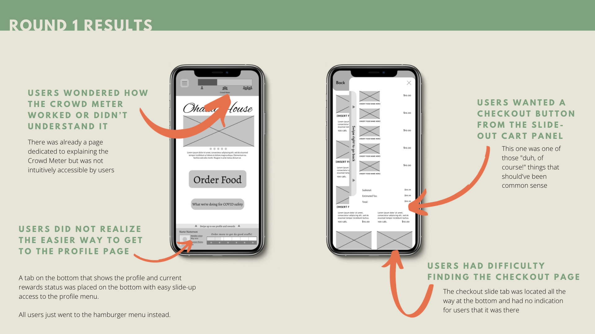
After refining the design to address the results, the second usability study used a high-fidelity prototype and helped further iterate on needed refinements.

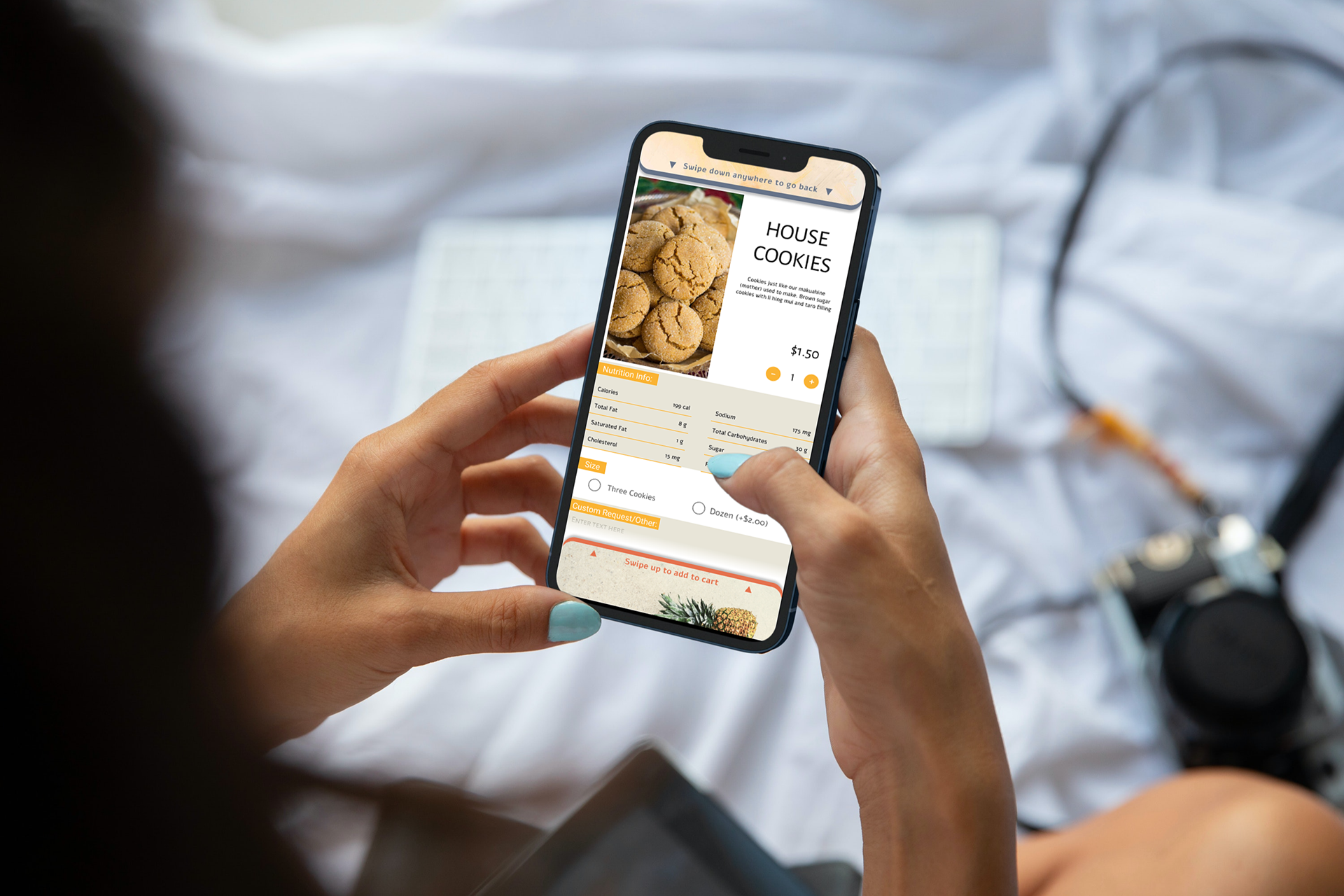
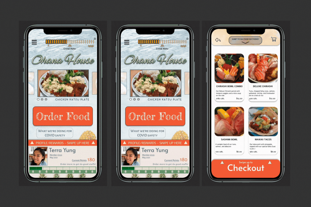
Mockups
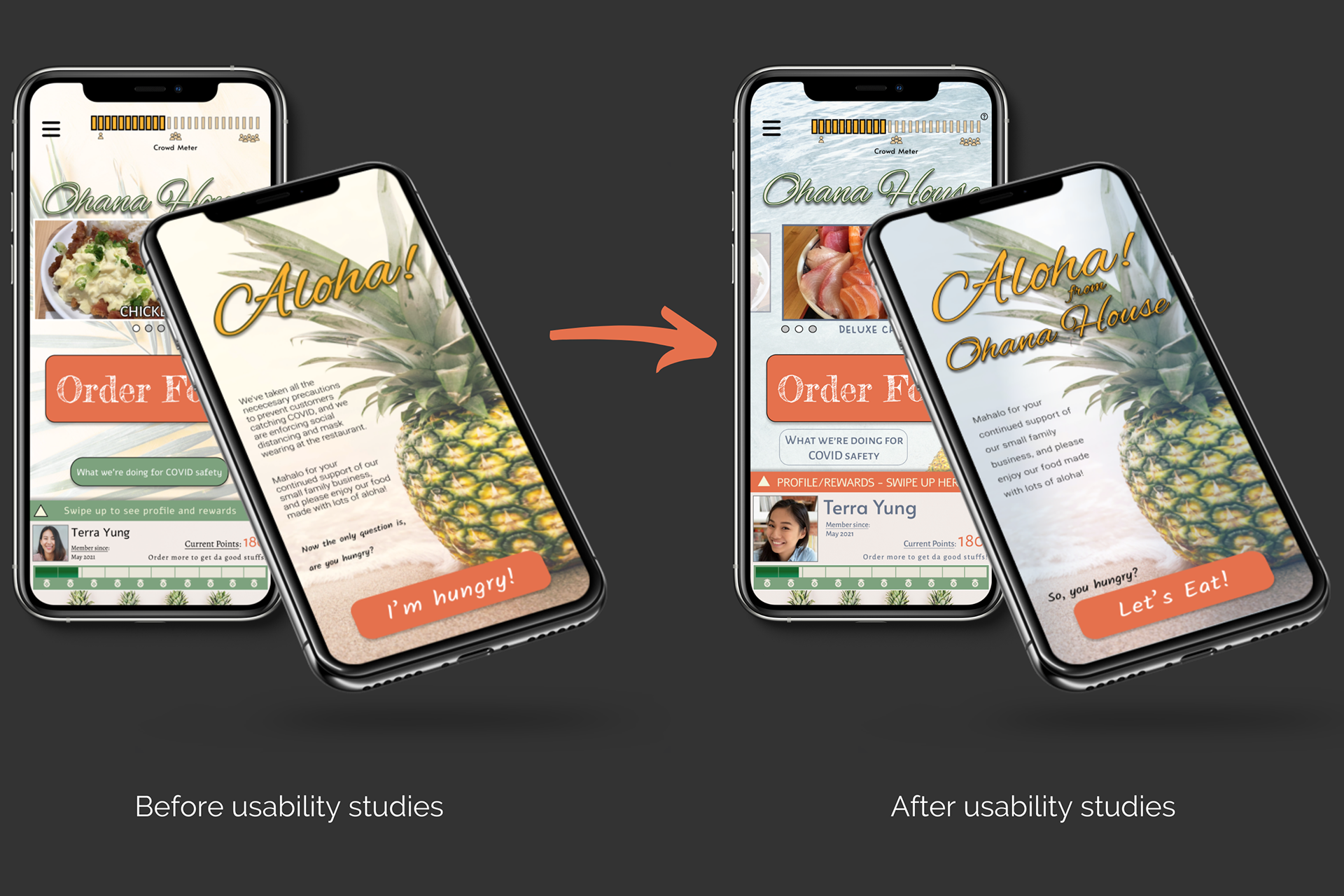
I kept the pineapple theme and general layout but after usability studies, I minimized the text to increase negative space while emphasizing the profile on the bottom.
Other Improvements:
• Small question mark icon added to crowd meter to assist users curious about it
• Profile picture, name, and swipe instructions on bottom tab and swipe up caption enlarged for better visibility
• Background image changed to increase contrast, and highlight CTA (Call to Action) button
• Decreased amount of text on the welcome screen for a cleaner, easy-to-read look
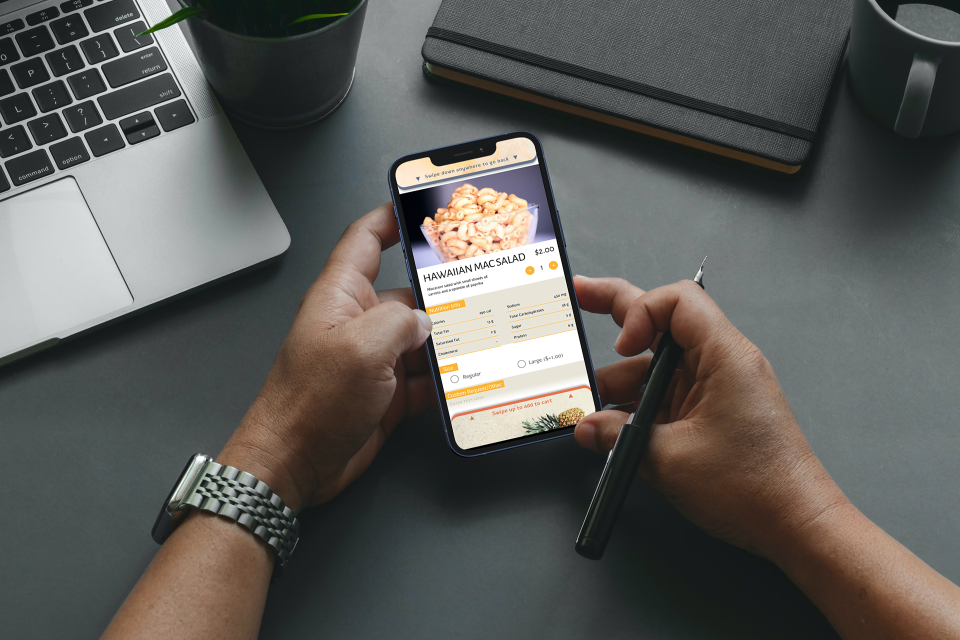
• Full nutrition facts were added for all items
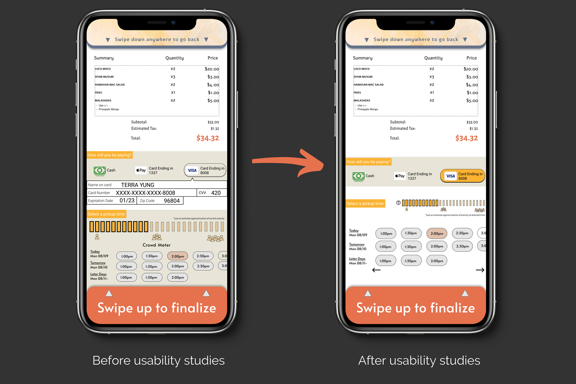
The second usability study found every participant stating the payments and pickup time page was too cluttered and busy. To solve that issue, I removed some of the tan backgrounds, increasing the negative space which helps give it a more open look.
Decreasing the size of the covid meter was also a good iteration on the design.

Logo Creation

Logo ideation process

Final Logo
Many iterations were made and tinkered with while keeping with the pineapple theme and trying to incorporate the initials of the company.
Creating a logo was a surprisingly fun process and I'm looking forward to creating new logos in the future.
High-fidelity prototype
The final version of the high-fidelity prototype presented a user flow that is easy to use.
It also met user needs by having a clean interface, presenting the COVID information such as the Crowd Meter easily, and has an accurate menu with high quality photos.
Feel free to explore the high-fidelity prototype here.
Check out the food!
Read the about the restaurant's history!
See how many calories they have in their mac salad!
Learn what they're doing about COVID!
And more!
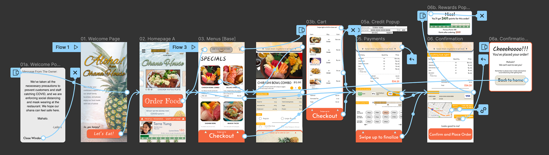
Map of the main user flow
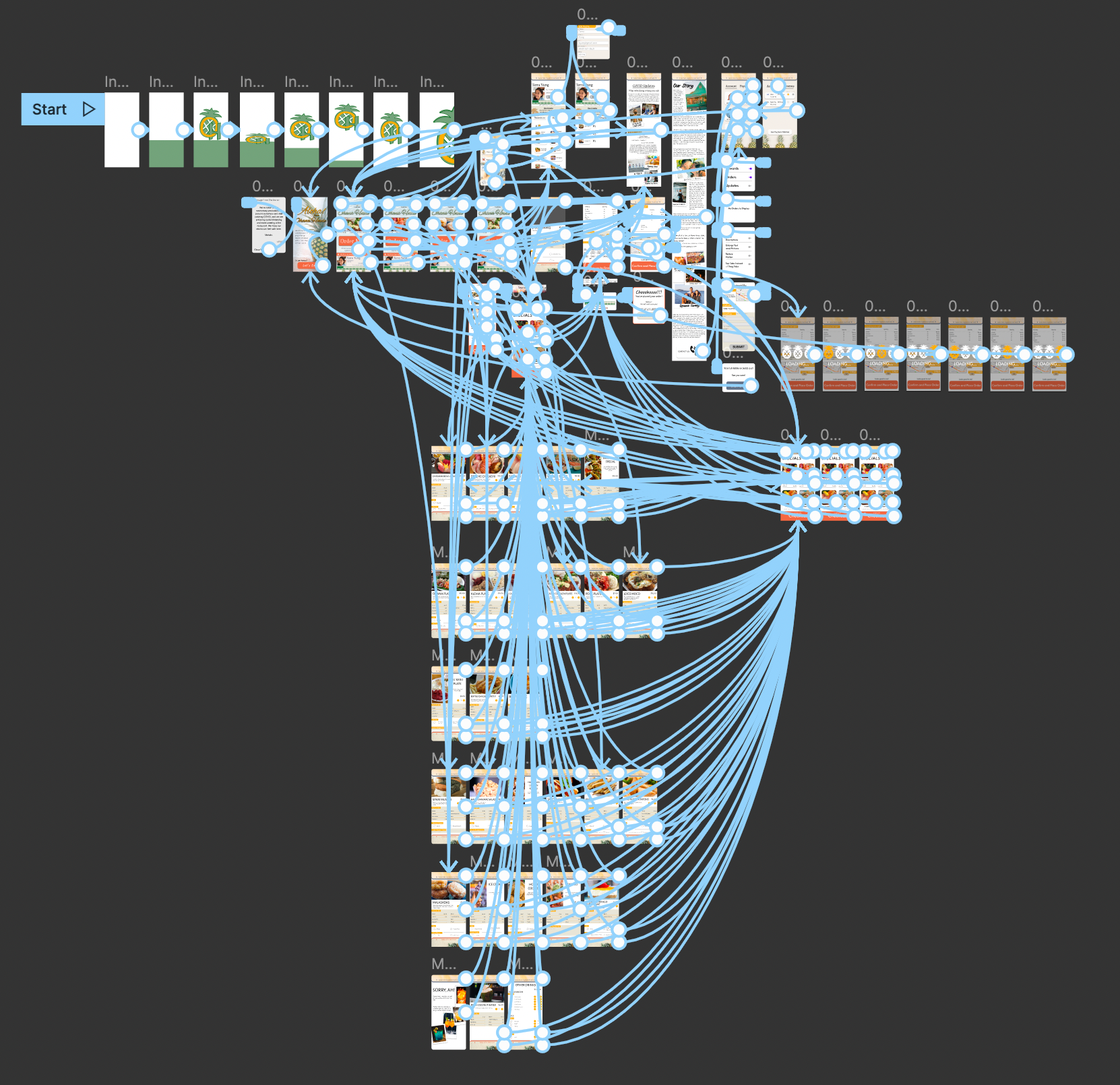
Map of the entire app flow
Considering Accessibility
• Large icons, large tabs, and large text to make navigation easier.
• An option to tap the tabs instead of swiping was added for those who may have physical disabilities.
With this being my first UX project and first case study, I possibly got a little too into it. I fully fleshed out all the food and menu options even though I didn't need to. I had a lot of fun on this and will probably come back to it in the future to make a new iteration of it.